Tweet
Replying to @josecastillo
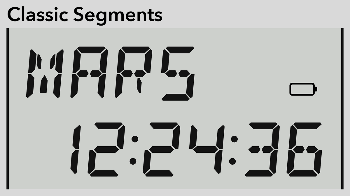
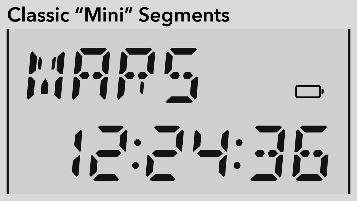
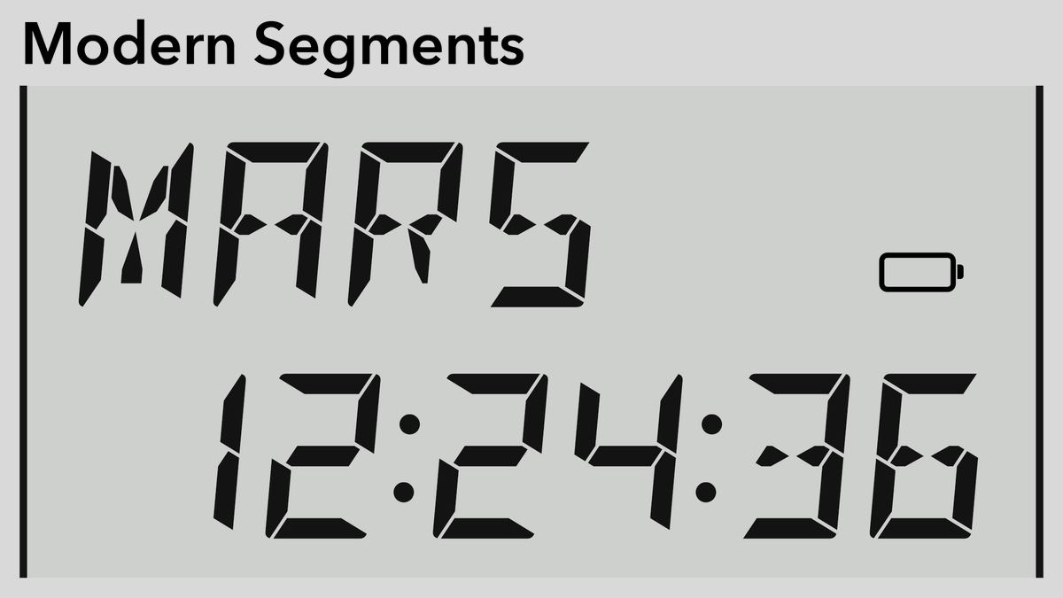
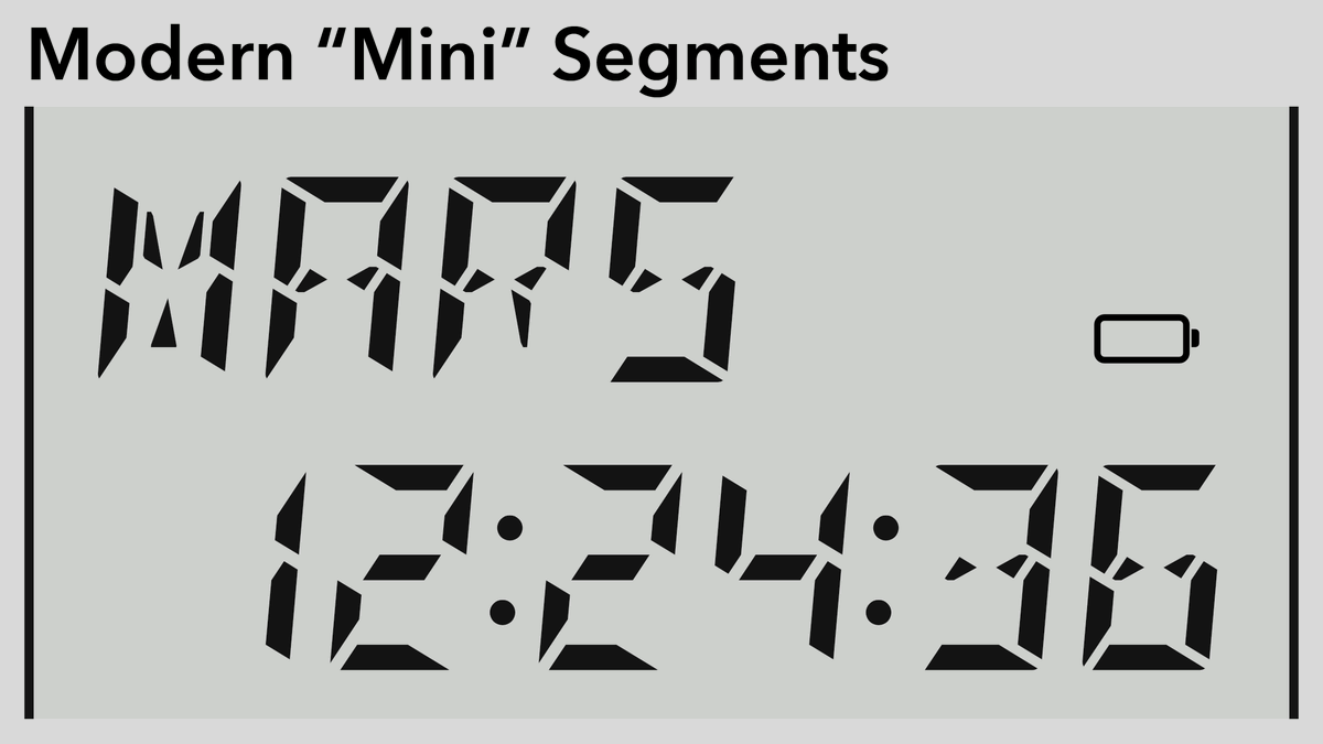
Credit where due: this is the DSEG font by @keshinomi_88pro: https://www.keshikan.net/fonts-e.html
“Classic” is your classic 7- and 14 segment glyph: bold & eminently readable.
“Modern” feels more angular and (dare I say) cyberpunk?
The “mini” versions shrink the segments and enlarge the gaps.


(original)