Tweet
Replying to @josecastillo
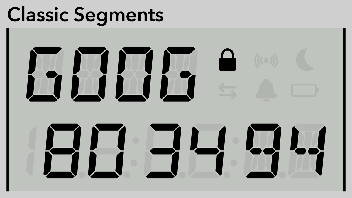
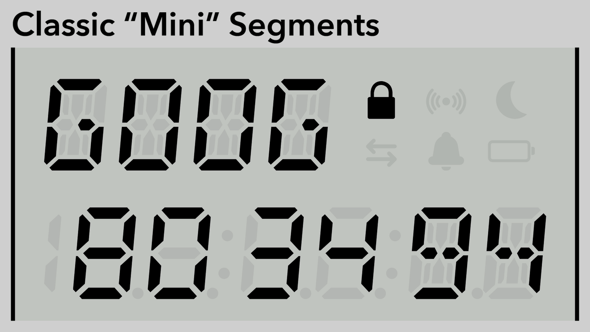
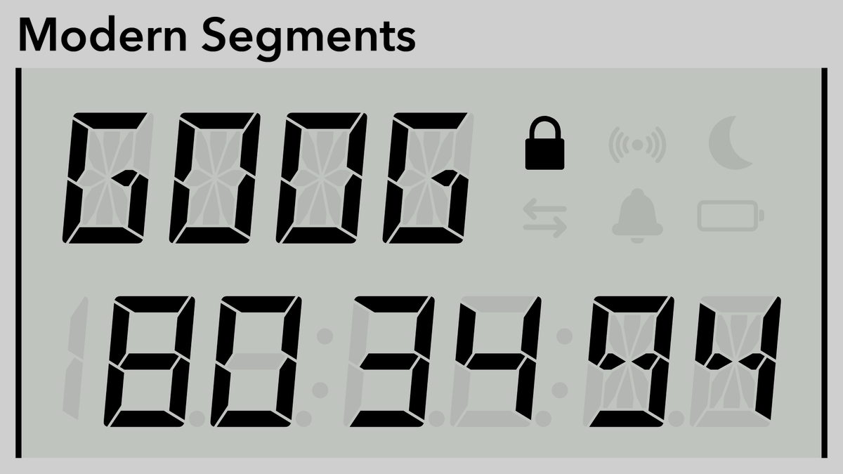
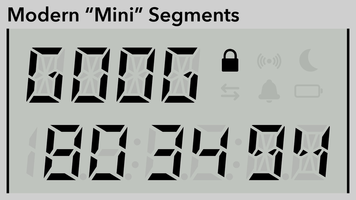
Once more with some more contrast. The colons in the bottom line do kind of shove the digits into groups of two, but I think it’s still pretty readable, and it makes the clock mode look much nicer.
(original)
Replying to @josecastillo
Once more with some more contrast. The colons in the bottom line do kind of shove the digits into groups of two, but I think it’s still pretty readable, and it makes the clock mode look much nicer.


(original)