Tweet
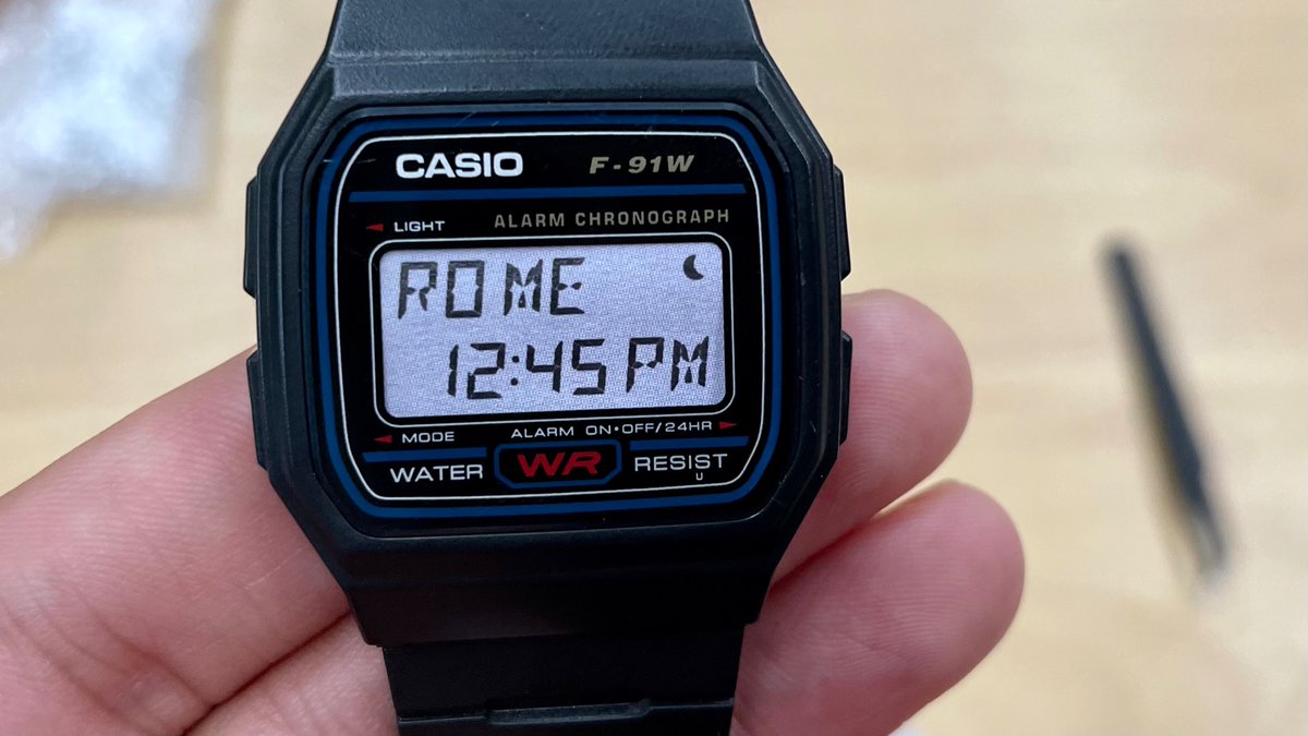
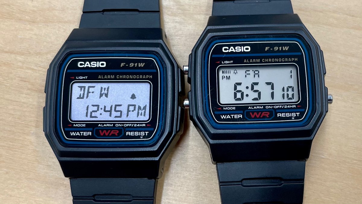
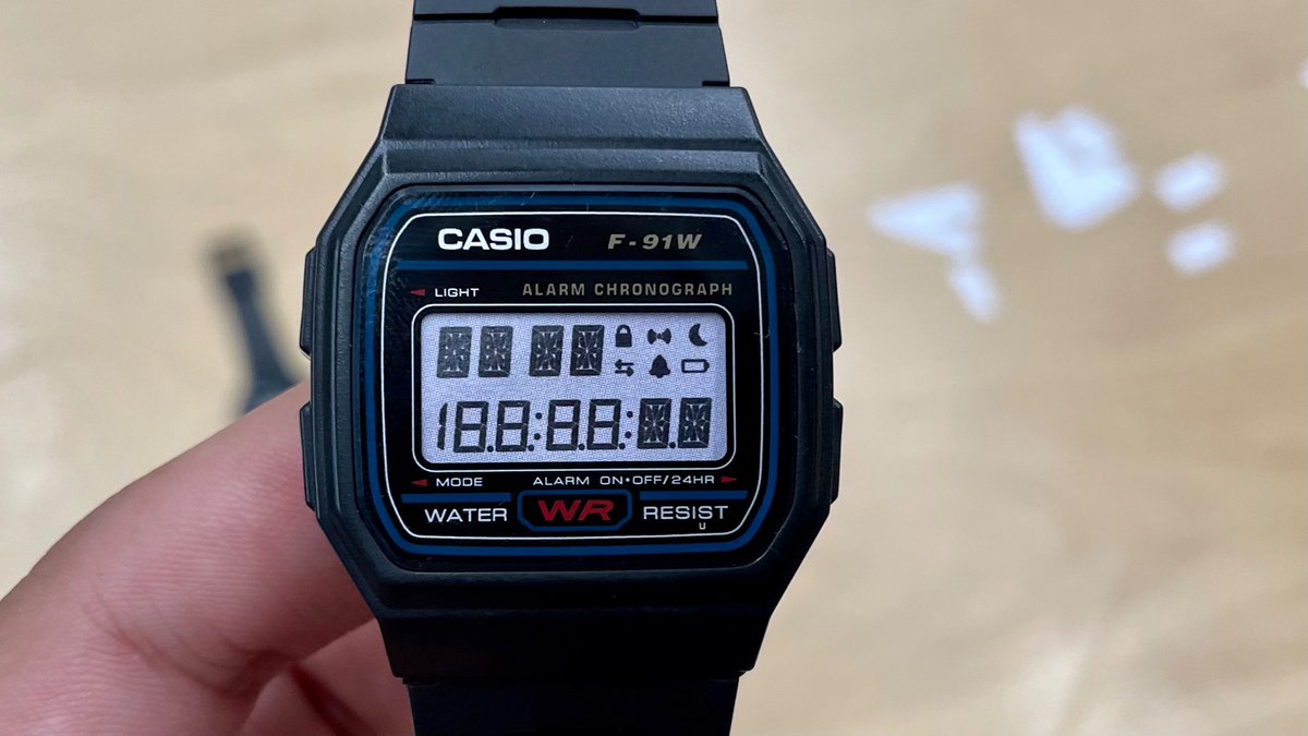
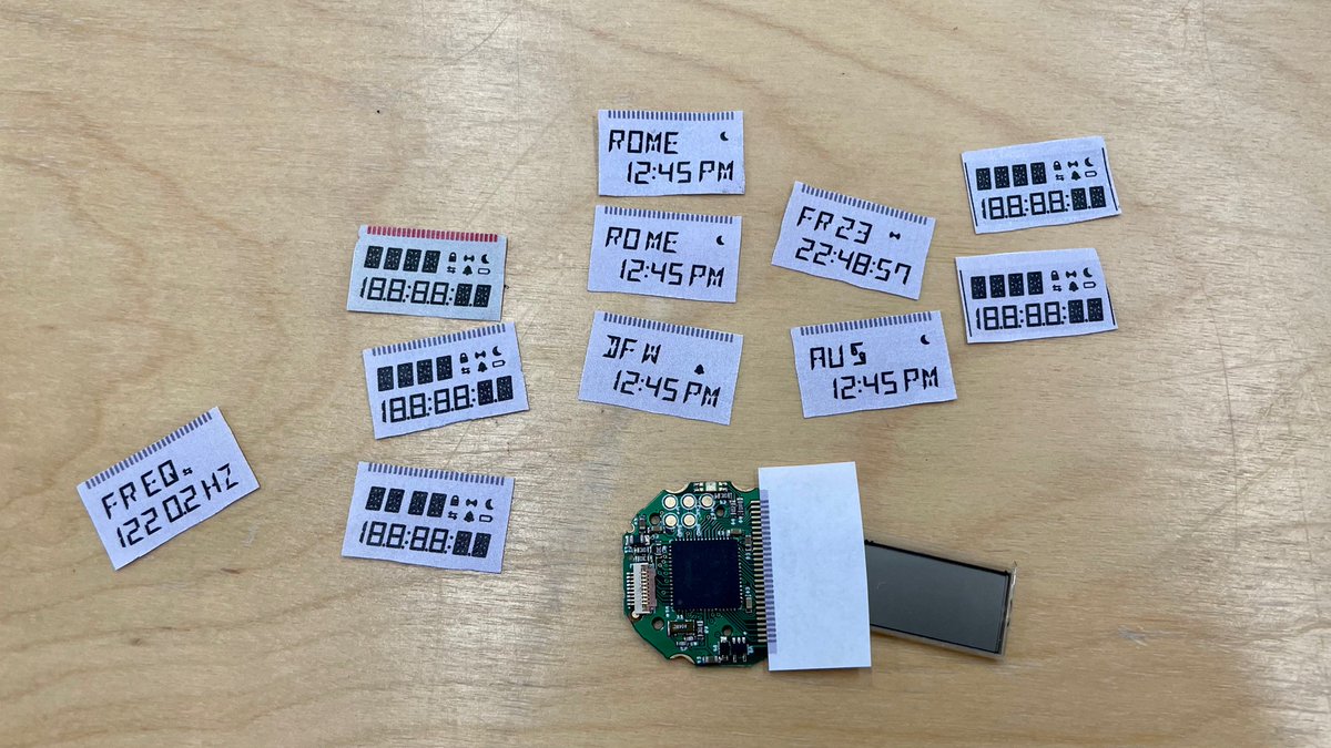
Paper craft screen tests. Findings: I had to shrink the font by a half point, and scoot the icons around. Also realized that putting a space between the 4 characters at the top left doesn’t affect readability much, and makes it possible to use it for two groups (i.e. day & date).


(original)