Tweet
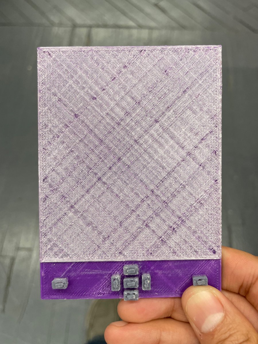
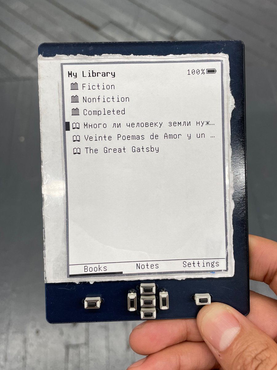
Today’s thought: killing sacred cows. Ever since the first plastic E-Book Wing mock-up (ca. 2019), the previous and next page buttons have been at the far left and far right. Today considering the possibility: is it more ergonomic to have them nearer to the center of the device?


(original)