Tweets
Replying to @sinusoidal
that’s actually really good feedback; I need to add a big friendly arrow pointing to pin one of the SOIC.
(original)
Replying to @josecastillo
There are thirteen surface mount parts to solder on this board, plus the seven through-hole buttons and one through-hole battery holder. We’ve come a long way from the “kitchen sink” complexity of the very first design. https://twitter.com/josecastillo/status/1188843059628380160
(original)
Replying to @josecastillo
In general, every part now only fits on one pad: there’s one SOT-23 MOSFET, one SOIC, and all the switches, buttons and castellated modules (as well as the SD card slot) have obvious and unique footprints that make it clear where they belong.
(original)
Replying to @josecastillo
Some other nice tweaks, now that I’ve simplified it further: the one 1µF capacitor is 0805-sized, whereas the two 10µF capacitors are 1206. Same with the resistors: 10k’s are 1206, 1k’s are 0805. A visual cue to tell you which one goes on which pad.
(original)
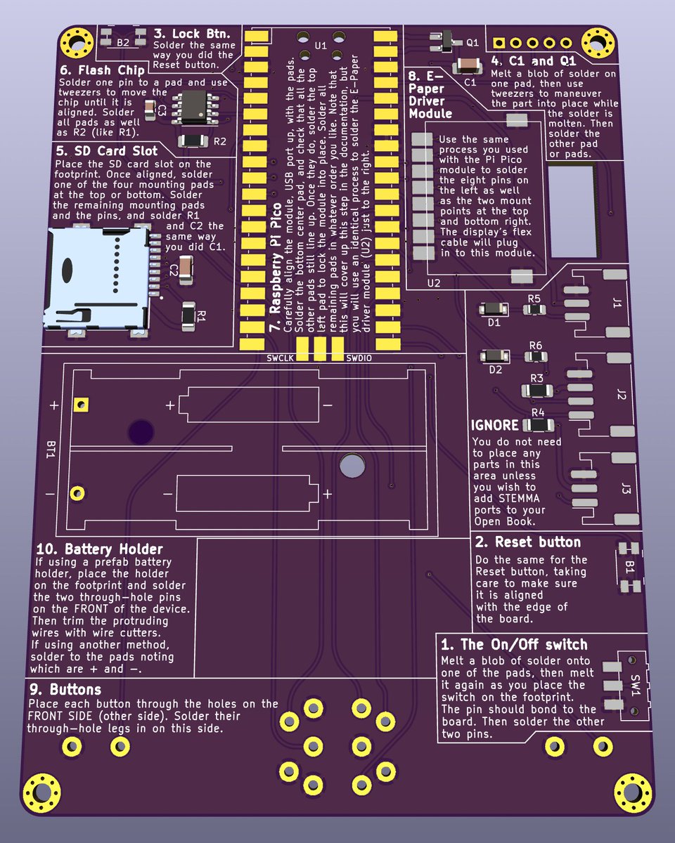
it wouldn’t be an Open Book board without relentless documentation. New concept: instead of explaining what the parts do, use the space to explain how to get the parts onto the board.
(original)
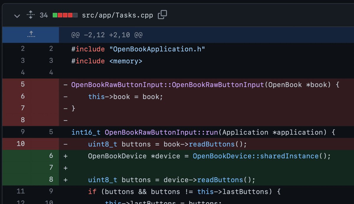
this was a power hour of a sunday morning refactor, but it boils down to a simple realization: there’s only one device. I don’t need layers upon layers of dependency injection to ensure things have a reference to it. It’s a singleton if I’ve ever seen one. https://github.com/joeycastillo/libros/compare/26456583b6c3688d46f1f417d46845bdff96c800...aa8245227b1e39d2ca5228cb0d000d0c1df493f8
(original)
in other saturday accomplishments: lock screen is real. Haven’t measured the current consumption yet, but this goes into the RP2040’s DORMANT sleep mode when locked, and resets on wake. Future goal is to resume from the same place but — this is becoming a refrain — it’s a start.
(original)
Replying to @josecastillo
i mean look at that! tell me it doesn’t bring a tear to your eye.

(original)
Replying to @josecastillo
at some point I will do the Open Book Feather with ESP32-S3 (or whatever their RISC-V module is by then), and it will be slim and svelte and charge over USB. but I want to be able to share _something_ sooner than that, and in a time of wild part shortages, I think this may be it.
(original)
Replying to @josecastillo
Whatever happens, I feel pretty good about the choice to do alkaline instead of Lipo. The Pi Pico’s buck/boost means I can get away without any power supply of my own on board, and it removes significant complexity for DIY soldering, which is how I’m going to get V1 out the door.
(original)
Replying to @josecastillo
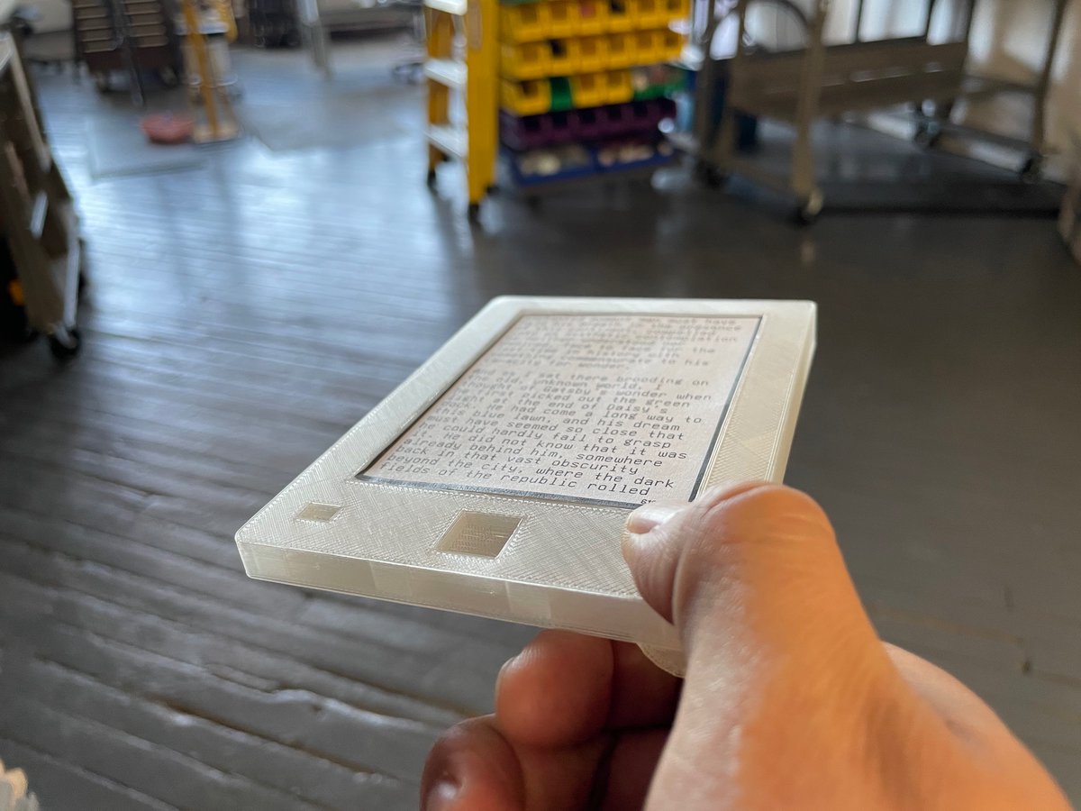
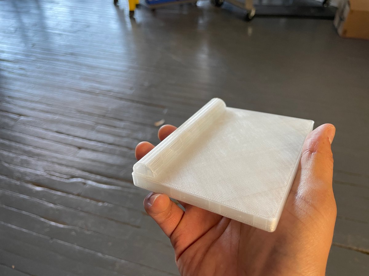
printing this mockup now. not the final form of anything, but if it feels reasonable in hand, maybe a starting point for something.
(original)
Replying to @josecastillo
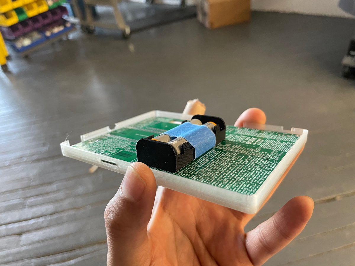
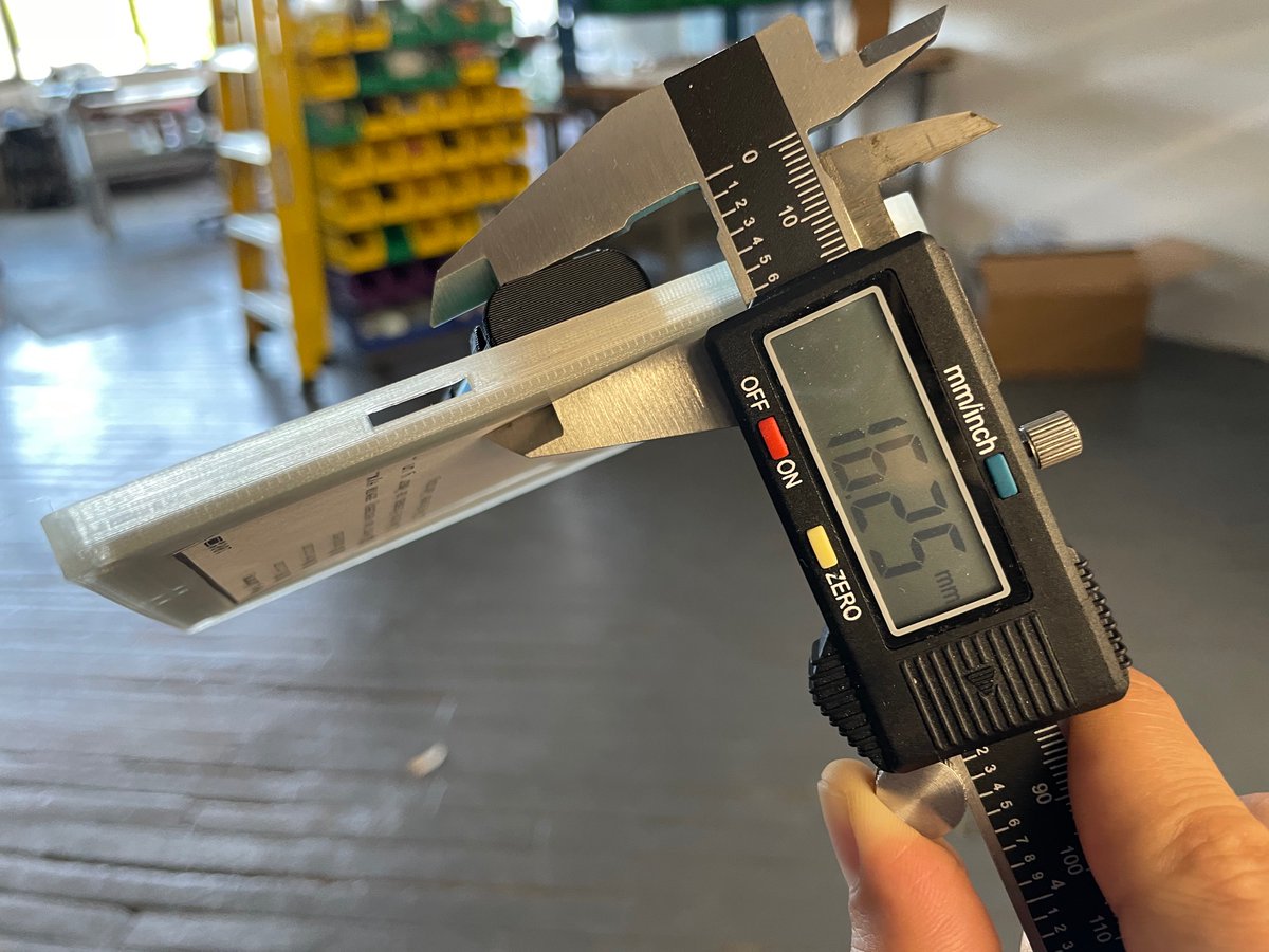
it seems like there’s no way around it: AAA batteries add chunkiness to the book. Along the side they interfere with pressing the previous or next page buttons, which feels wrong, so I think they’ll have to go in the middle. The weight feels balanced. But how to manage the chonk?
(original)
Replying to @josecastillo
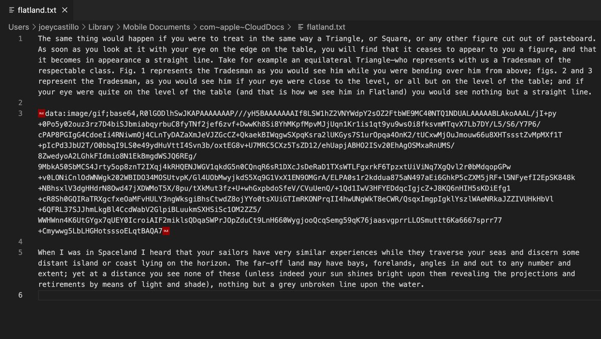
the inline image thing may be too much; it dramatically limits the readability of the plain text file in any other context. Maybe images live in files alongside the book, and we do it like:
[DLE]image:figure01.gif[DLE]
Translation: interpret these bytes as embedding that image.(original)
Replying to @josecastillo
oh! I almost forgot. Inline images. For this one, I may in fact be losing it. U+0010: Data Link Escape. “Cause a limited number of contiguously following octets to be interpreted in some different way, for example as raw data. The details of this are implementation dependent.”
(original)
Replying to @josecastillo
anyway. I still don’t have a good solution for underlining or strikeout (DC1-DC4?), and frankly the Open Book may never be able to display a work like House of Leaves correctly. but these creative uses for long-standing control codes in plain text streams feel like a start.
(original)
Replying to @josecastillo
fun thing: I tried using the shift in / shift out characters in that tweet, to emphasize the word ‘completely’, and Twitter silently stripped them out. see, programs know how they want to handle (or not handle) these control characters!
(original)
Replying to @josecastillo
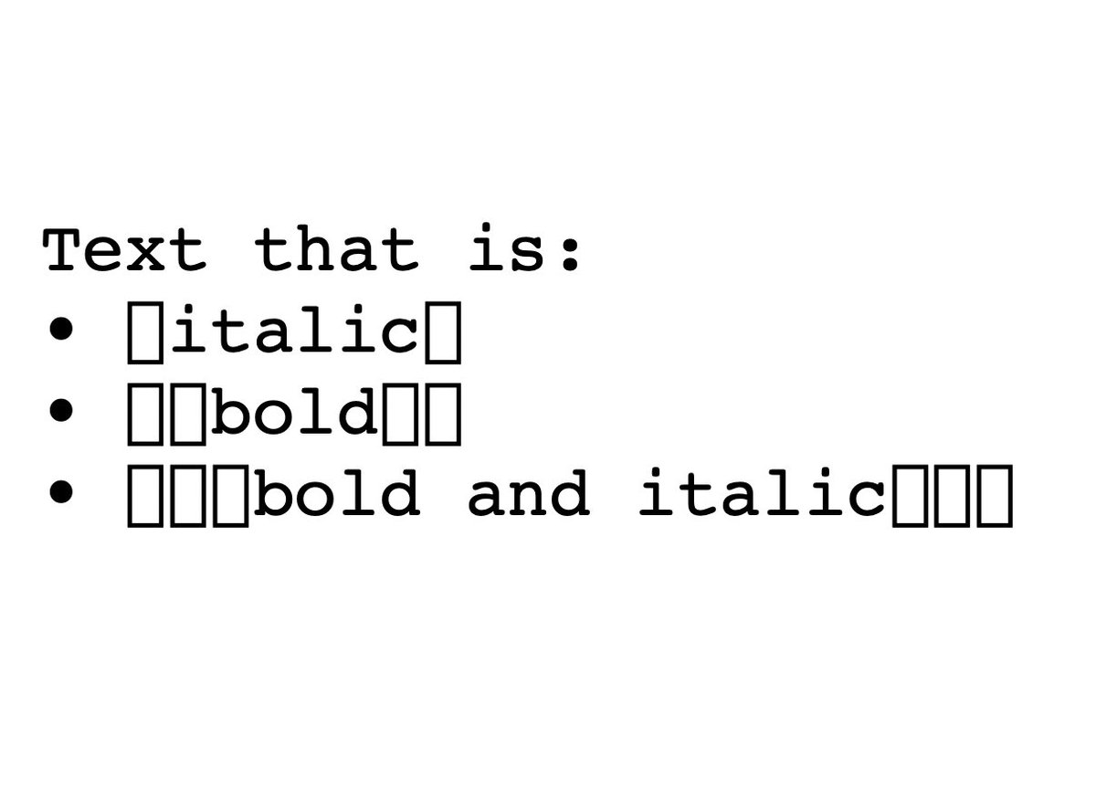
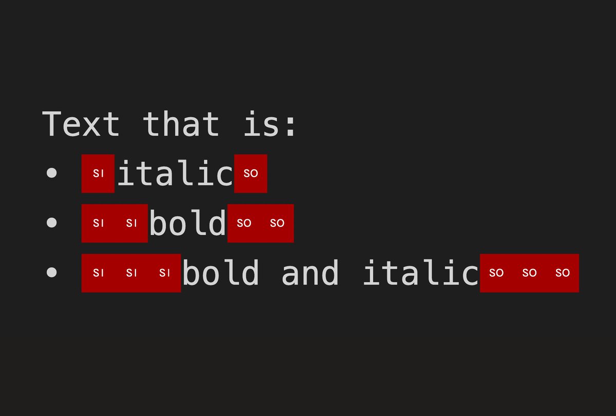
some programs like TextEdit would just ignore the codes. others (here Safari) would render them as blocks. Either way: semantically it’s not, y’know, completely incorrect, and the Open Book could use these codes to render the text in the desired style.
(original)
Replying to @josecastillo
Have I completely lost it? Stacking the old teletype code for emphasis now signals increasing levels of emphasis: shift once for the italic style, twice for the bold style and three times for both.
(original)
Replying to @josecastillo
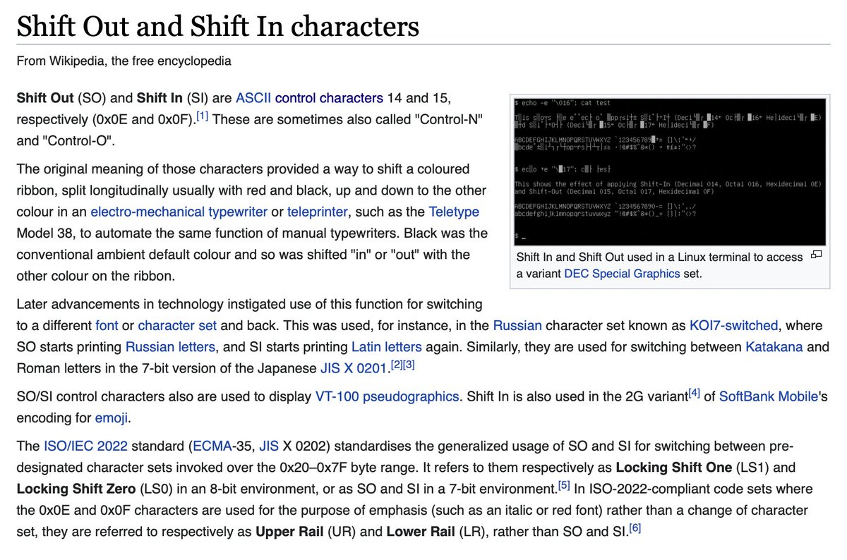
believe it or not, teletypes had this problem too. Sometimes you wanted to print text in red for emphasis, and the ASCII character set needed to allow for that. Control point U+000F shifts the teletype ribbon to red and U+000E shifts it back to black. Hey, I don’t make the rules!
(original)
Replying to @josecastillo
where it gets weirder: bold and italic text. Books use formatting. Plain text doesn’t. Markdown has plaintext options for emphasis, like **bold** and _italic_, but the problem is, authors could use these characters in their works; we don’t want to mess with the text. What to do?
(original)
Replying to @josecastillo
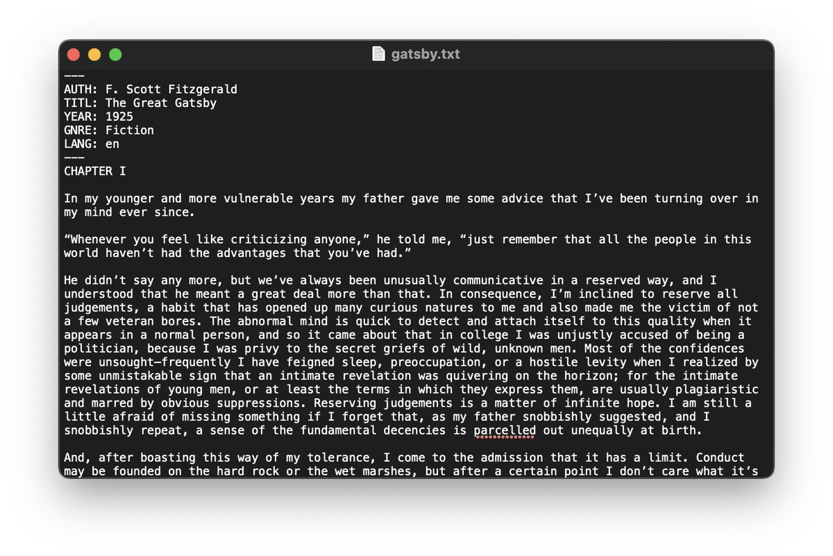
we’re not doing anything too weird here; this is a tale as old as ASCII and teletype, and programs more or less know how to deal with these control characters. Here, the macOS text editor simply doesn’t render the character (while preserving it if you edit and re-save the file).
(original)
Replying to @josecastillo
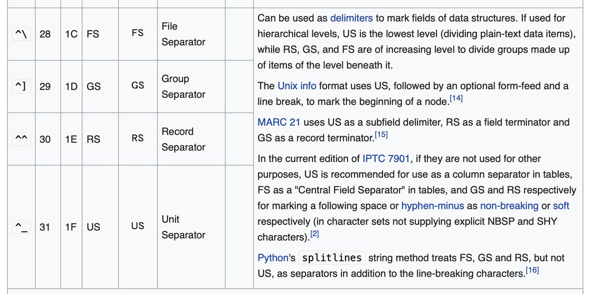
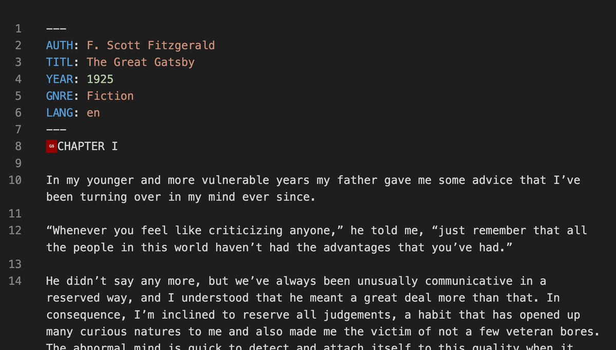
Meet Unicode code points U+001C-U+001F. That red box before Chapter 1 above? It’s the “Group Separator”, a control character meant to separate groups of information. My thinking: use these to delimit volumes, units and chapters of a book, which could inform a table of contents.
(original)
Replying to @josecastillo
trailing hyphens end the front matter and from there it’s just plain text in any language. Well, plain text for the most part. but ASCII (and by extension Unicode) has some old codes that can help us implement additional features in a semantically meaningful way.
(original)
Replying to @josecastillo
(also the four byte opening sequence, “—\n”, functions as its own 32-bit magic number. there’s no guarantee that what follows is an Open Book-compatible text file, but we’ll figure that out soon enough)
(original)
Replying to @josecastillo
initial notes: front matter. I need a way to identify crucial metadata about a book. This isn’t YAML, it’s just four-byte keys followed by a colon, and everything through the newline is the value. Making them 4 bytes means I can read the tags as a 32-bit int, simplifying parsing.
(original)
a THREAD on book format thoughts. I have always imagined the canonical format for books on the Open Book would be plain UTF-8 text. Soon I’ll have to write code to handle all that. Trying to capture the state of my thinking, but this, to me, feels like the beginning of gatsby.txt
(original)
Replying to @deshipu
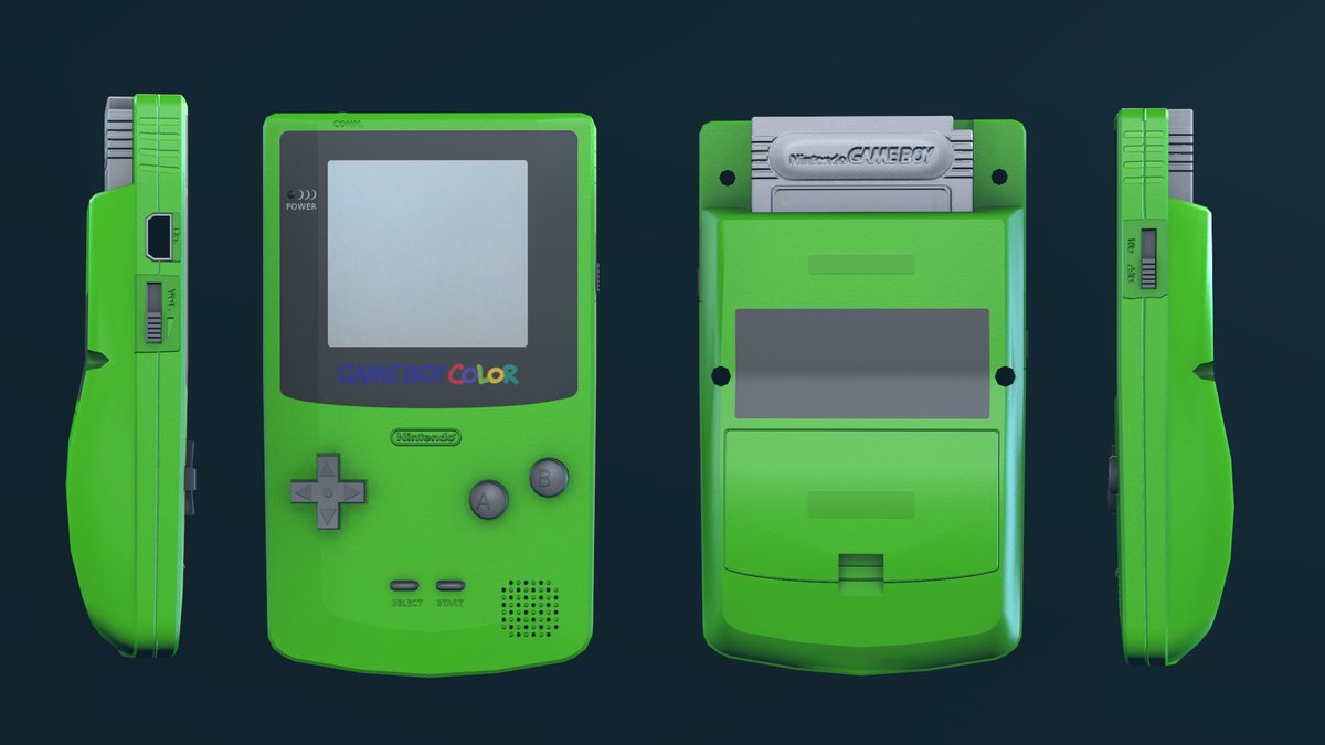
it might not solve the thickness issue, but at least it pushes it a bit further up from where the reader is holding the thing. I mean, this sort of thing is not without precedent…
(original)
Replying to @deshipu
This might be the answer. Surface mount, so nothing protrudes in the screen’s keepout area on the front, mounted dead center for balance and slightly above the keepout area for the buttons. https://www.aliexpress.com/item/2255800953361547.html
(original)
Replying to @deshipu
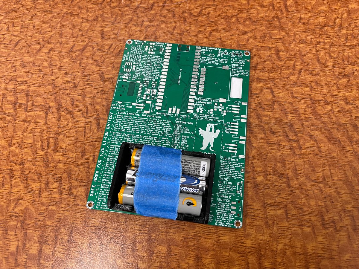
The balance in hand also feels off… the batteries are the heaviest thing in the device and it’s weird that they’re stacked up on the right. Something like this actually feels quite nice in the hand, but of course it interferes with the through hole buttons in that spot.
(original)
Replying to @deshipu
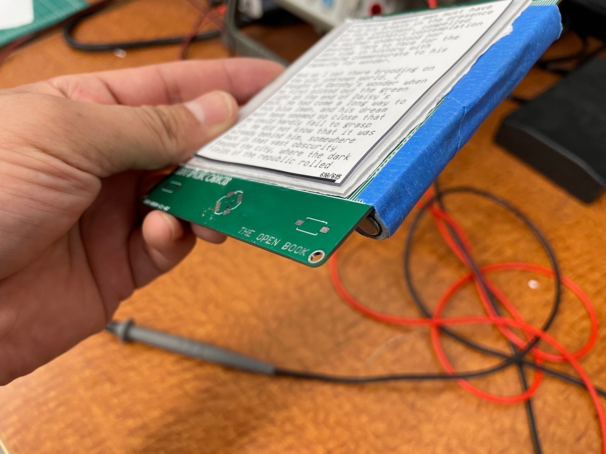
So far unfortunately it does feel awkward. The extra thickness is right where the “next page” button is, and it feels awkward. And that’s with just the batteries, not even the extra thickness of the holder. Going to need to work on this some more.
(original)
Replying to @deshipu
I should do some 3D printing to try to get a sense for it. As designed now, the batteries would be on the right side near the “next page” button, which could feel awkward or could feel nice and “grippy”. I won’t know though until I hold it in hand…
(original)
Replying to @josecastillo
• a battery holder, which holds 2 AAA batteries
• an SD card slot
• a 2 megabyte Flash chip for storing language data
• a Raspberry Pi Pico module
• a castellated module with the e-paper driving circuit, preassembled.
that’s it. that is a functional device for reading books.(original)
Replying to @josecastillo
this would only be for the “Abridged Edition,” the low cost, low part count, hand-assemblable version of the book. Not counting optional stuff (JST ports, SWD header) this gadget has 28 parts: 9 buttons, 1 switch, 8 resistors, 3 capacitors, 1 MOSFET and a handful of others:
(original)
Replying to @josecastillo
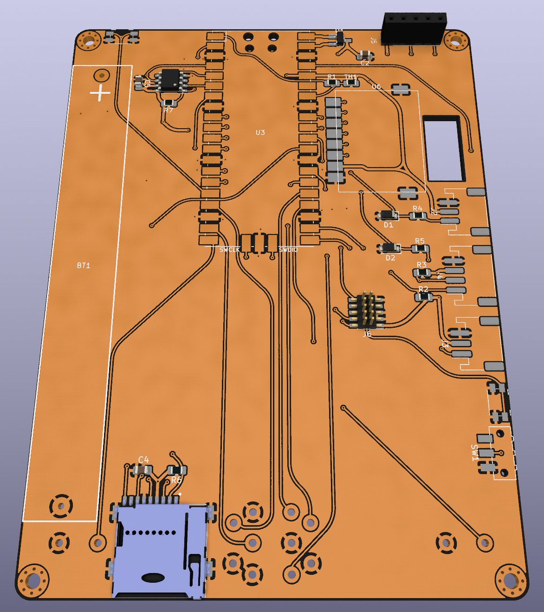
backside. The other big change is this: AAA batteries instead of a Lipo, using a battery holder recommended by @deshipu. It solves so many issues: no charging circuit means fewer parts, lower BOM cost without a battery included, and it would simplify shipping. Could work!
(original)
Replying to @TheSethKerr and @AndrewLeCody
Would be cool! Although it depends on two castellated modules, one of which only comes in green anyway (the Pi Pico), so the backside could end up less dramatic than you’d expect…
(original)
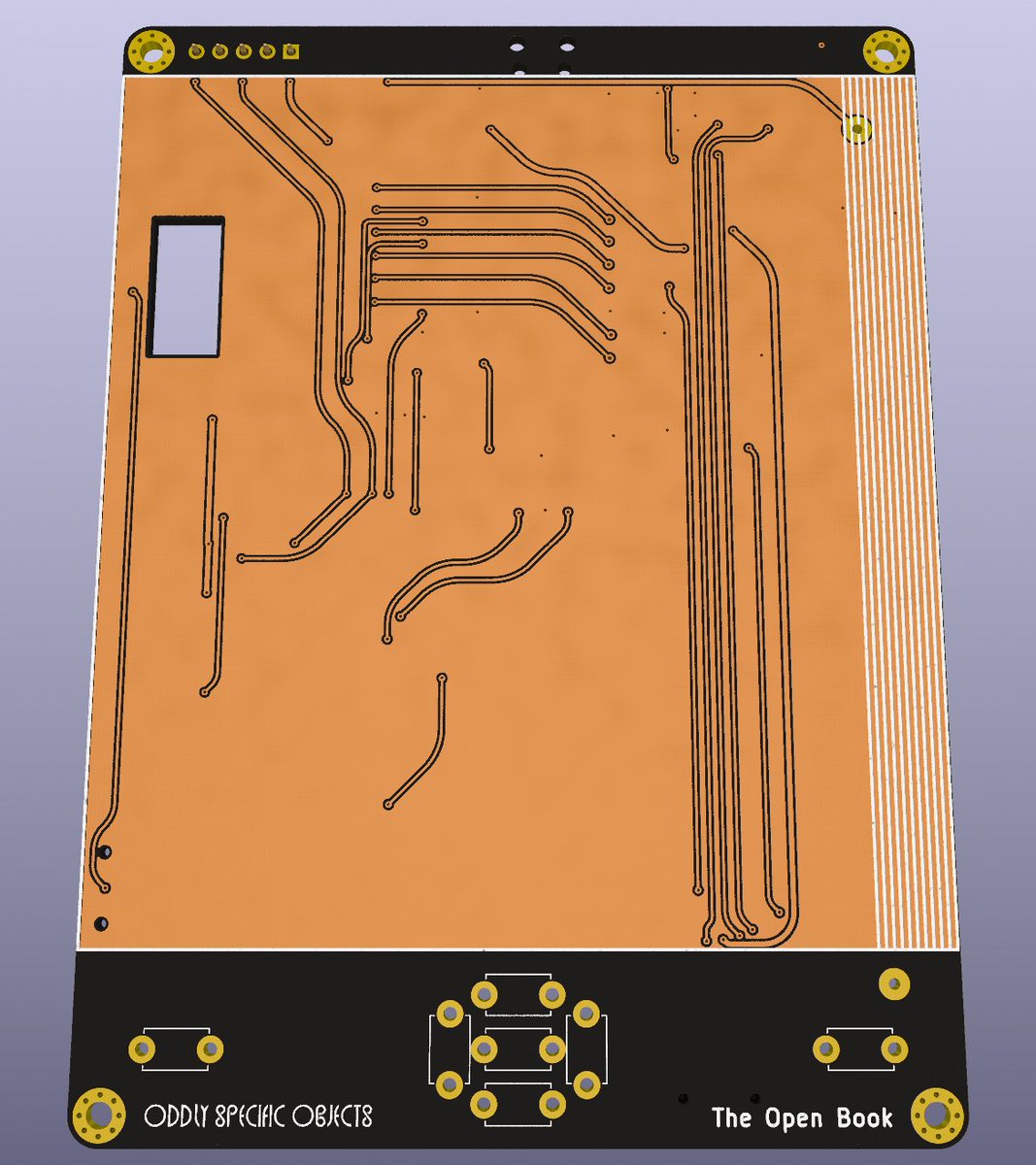
playing with the Pi Pico book design again, with help from some folks on the Oddly Specific Objects discord. Tried out the KiCad Rounded Tracks plugin at the suggestion of @AndrewLeCody, and wow does it make for a striking look:
(original)
I once lived in New York. i used to be able to hail a cab to go a few blocks for a few bucks. Now I have an app that allows me the privilege of paying too much money to a startup that pays not enough to a driver to drive me that same distance. anyway. we have built a dumb future.
(original)
Replying to @josecastillo
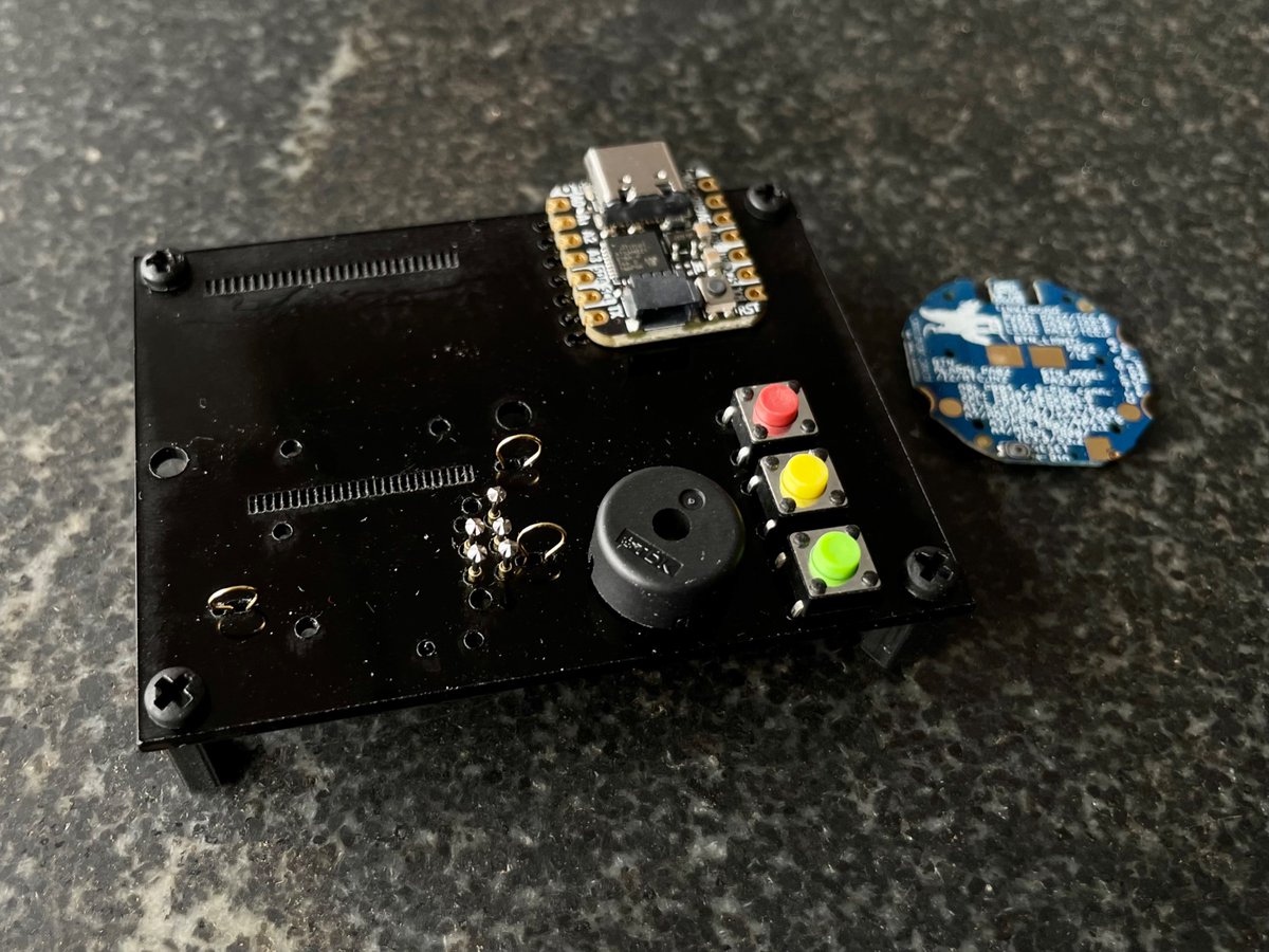
laser cut fit test. I don’t know if that one FlexyPin will play nice so close to the pogo pins, but hey, I’ve made my bed. that’s where the button contact is, and there was no room for a test point. If it doesn’t work it just means a more manual testing process for me :/
(original)
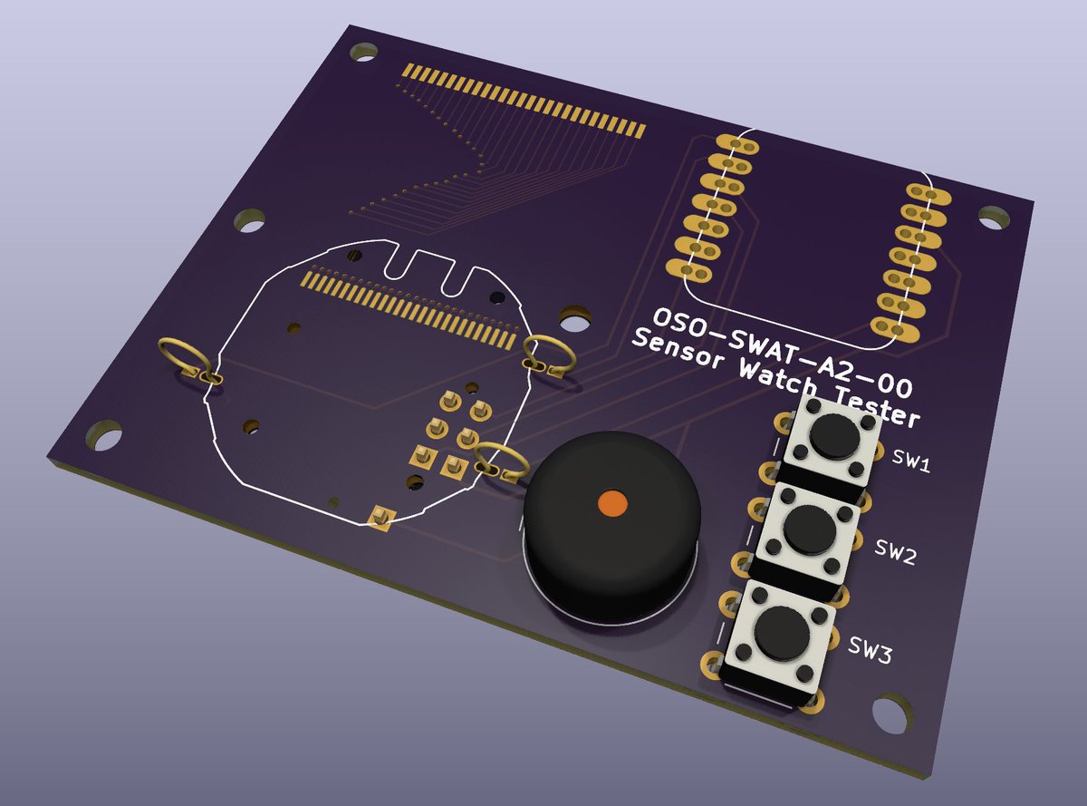
Am I thrilled about the routing on this board? Not particularly, no. Do I absolutely need to get it done, and fast? very, very yes.
(original)
Replying to @josecastillo
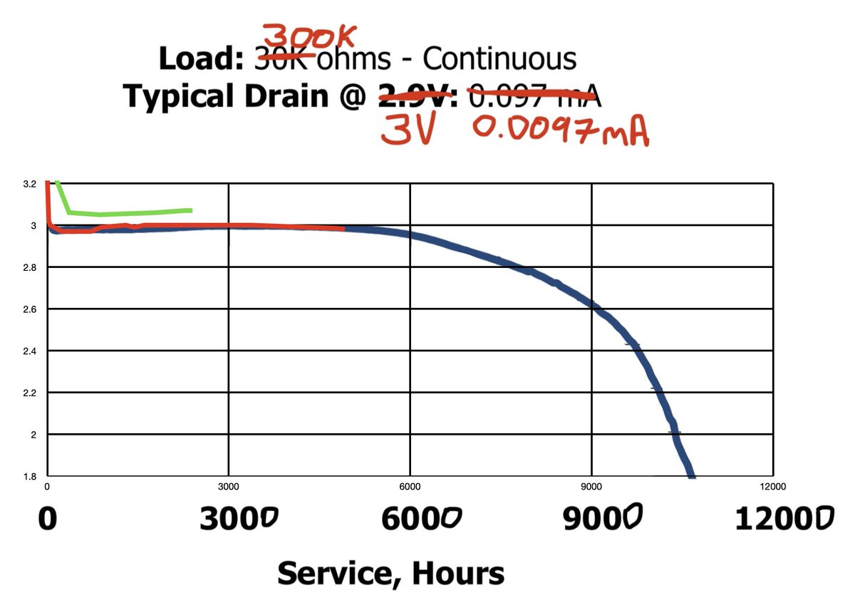
Same data, scaled to my hypothetical “one order of magnitude less power” simulation (which just adds a zero to the load and the time). Looking at it now, red line *might* still be on track for 10,000 hours — but I can hardly wait to see where green line goes!
(original)
Replying to @AlperenAkkuncu
Yup the MCU can run up to 3.6 volts, tho in practice the battery starts at about 3.3 V, and then declines within a day to its nominal voltage of 3 V ± 10 mV, where it stays for quite some time.
(original)
Replying to @AlperenAkkuncu
The MCU is designed to run as low as 1.63 volts. The LCD starts to dim below 1.5 volts, and while I’ve taken it down as far as 1.4, I suspect that it’ll be a matter of hours between those points; the curve declines sharply toward the battery’s end of life. https://twitter.com/josecastillo/status/1492935877265395717
(original)
Replying to @josecastillo
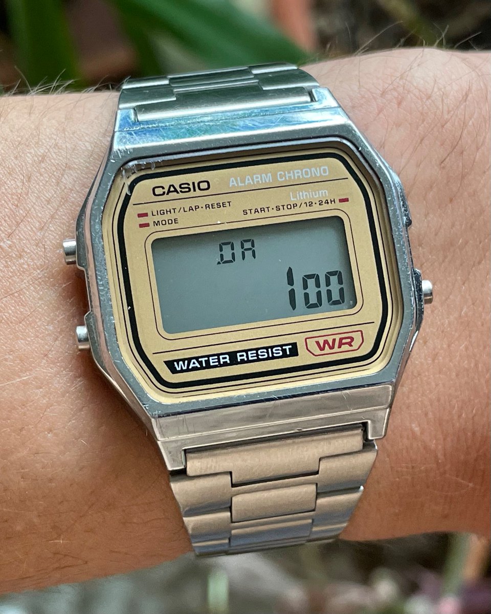
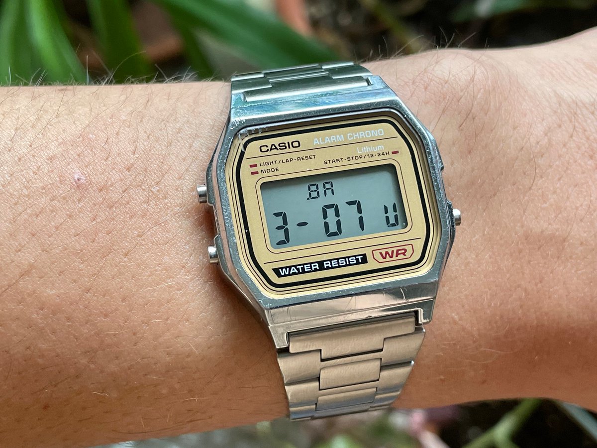
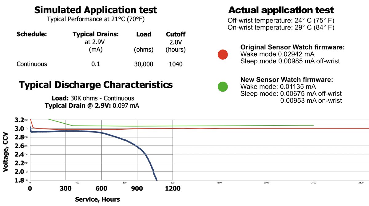
New battery test, day 100: 3.07 volts. I now have a spreadsheet tracking both tests, and thought it would be fun to overlay my data over the data sheet’s simulated application test (which uses an order of magnitude more power). The red line, the original test, is near hour 5,000.
(original)
Replying to @gabrielcsapo
I think I have a fix (main library uses GFX to draw, and I have a couple of custom widgets in the libros project that take a reference to my special Unicode drawing typesetter) but I’m sure I’ll address it in due time; hopefully when I do it can be pulled out to its own library.
(original)
Replying to @gabrielcsapo
Maybe at some point, but before I do, I need to solve a dependency issue… it had had a dependency on Adafruit_GFX for drawing, which made sense, but I needed to draw with my custom typesetter for Unicode text so I quickly refactored it to depend on that, which isn’t ideal.
(original)
RT @monadliker: anyways, it’s always absurd when computer folk yearn for a space to do technical work “without politics.”
my sweet summer…
(original)
sometimes the work is spreadsheets and packing.
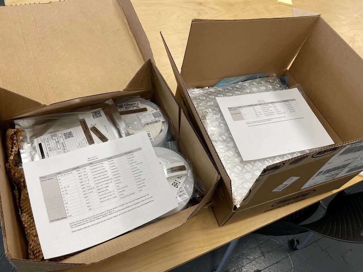
(original)
Replying to @anne_engineer
The project had its roots in my old circuitpyui project (which you mentioned in the newsletter at the time — thanks!!), but alas, all of this one is in C++.
(original)
Replying to @josecastillo
all in all despite some of the awkward syntax and occasional bugs, it feels like I’ve created a solid foundation. Alas now I have to put a pin in it, because work on the Sensor Watch beckons.
(original)
Replying to @josecastillo
For example: where before my progress bar was just me drawing on the screen, now I could create a ProgressBarView and add it as a subview of the page, all to be drawn when the window needs an update. I also foresee building view controllers to sit in between the model and views…
(original)