Tweets
back in the (suddenly less great) state of texas with an evening to kill, which means it’s time to repair this artifact. https://twitter.com/josecastillo/status/1407344121266814980
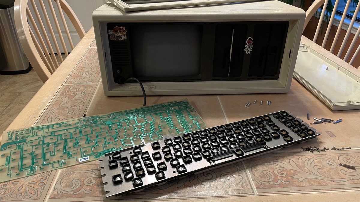
(original)
Replying to @pdp7, @devoopes, @bateskecom, @glowascii and @oshpark
question, just out of curiosity at this point: is it possible to do this but for other thicknesses? I would love to do a run of the watch I’m building in OSH Park purple; alas, 0.6mm is a hard requirement.
(original)
started writing an email just now and tried to type “Hi,” but my angle was off so instead it came out as “No.”
(original)
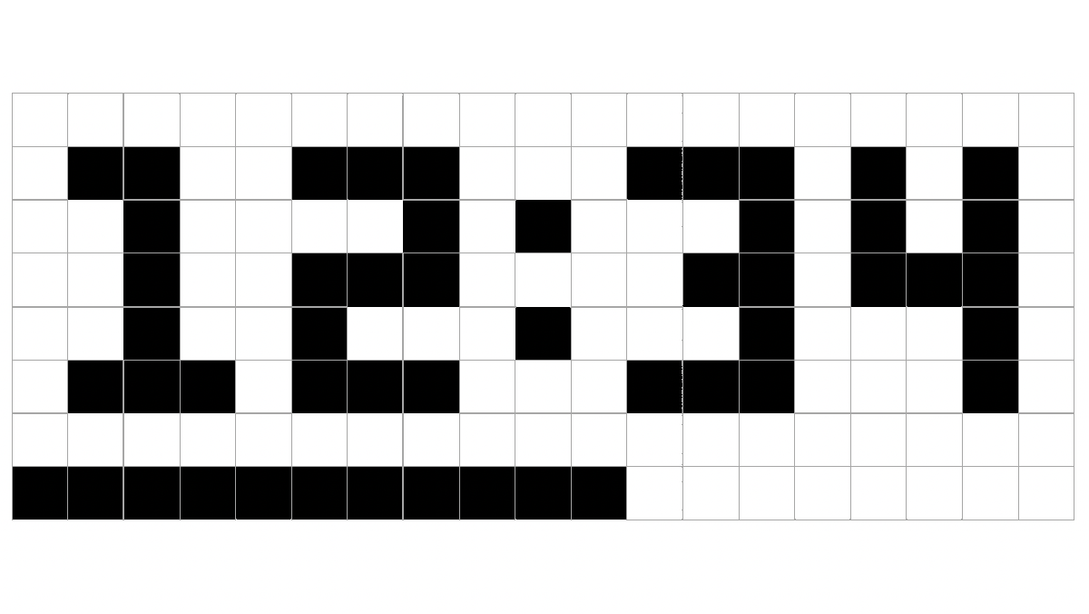
maybe the same lesson from earlier applies re: a small gap. with less than a half-pixel space between the top three and bottom five pixels, text breaks successfully into two lines, yet artwork still reads reasonably ok. These are 8x8 Tamagotchi babies /via https://wolfnanaki.tumblr.com/post/91706030212
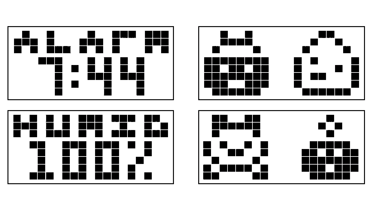
(original)
Replying to @philnelson
there are just so many possibilities!
(original)
new plan? 19x8 pixel grid with a 1mm gap between the top three and bottom five pixels. Still works with the 27 LCD pins in the watch, using 1/8 multiplexing and 19 segment pins.
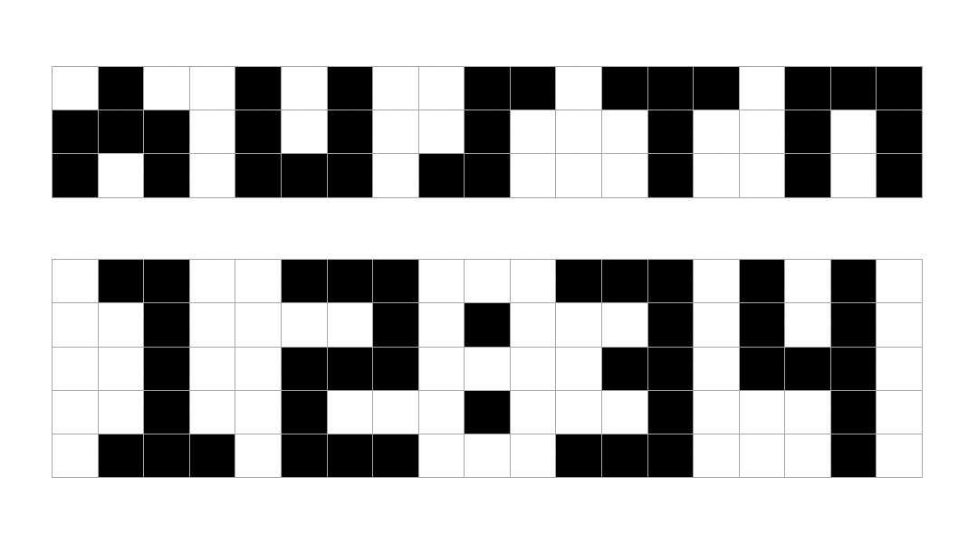
(original)
oh no https://twitter.com/hardmaru/status/1097409424140886017
(original)
Replying to @BillStewart415
in theory, six segments are capable of conveying 64 unique states — plenty of room for our paltry 26 letters and ten digits. I bet though that it would be a pretty wild looking layout if we tried.
(original)
Replying to @rpitechguy and @oshpark
It is! My goal is to keep manufacturing cost down by putting all surface mount parts on the bottom, and adding the button, battery connector and USB port myself later. I sense that if I’m doing 100 of these, I’ll get better yield with a thru-hole USB port than a surface mount one
(original)
Replying to @josecastillo
there’s some good art for my work sometimes, but tbh most of what I do now is spreadsheets
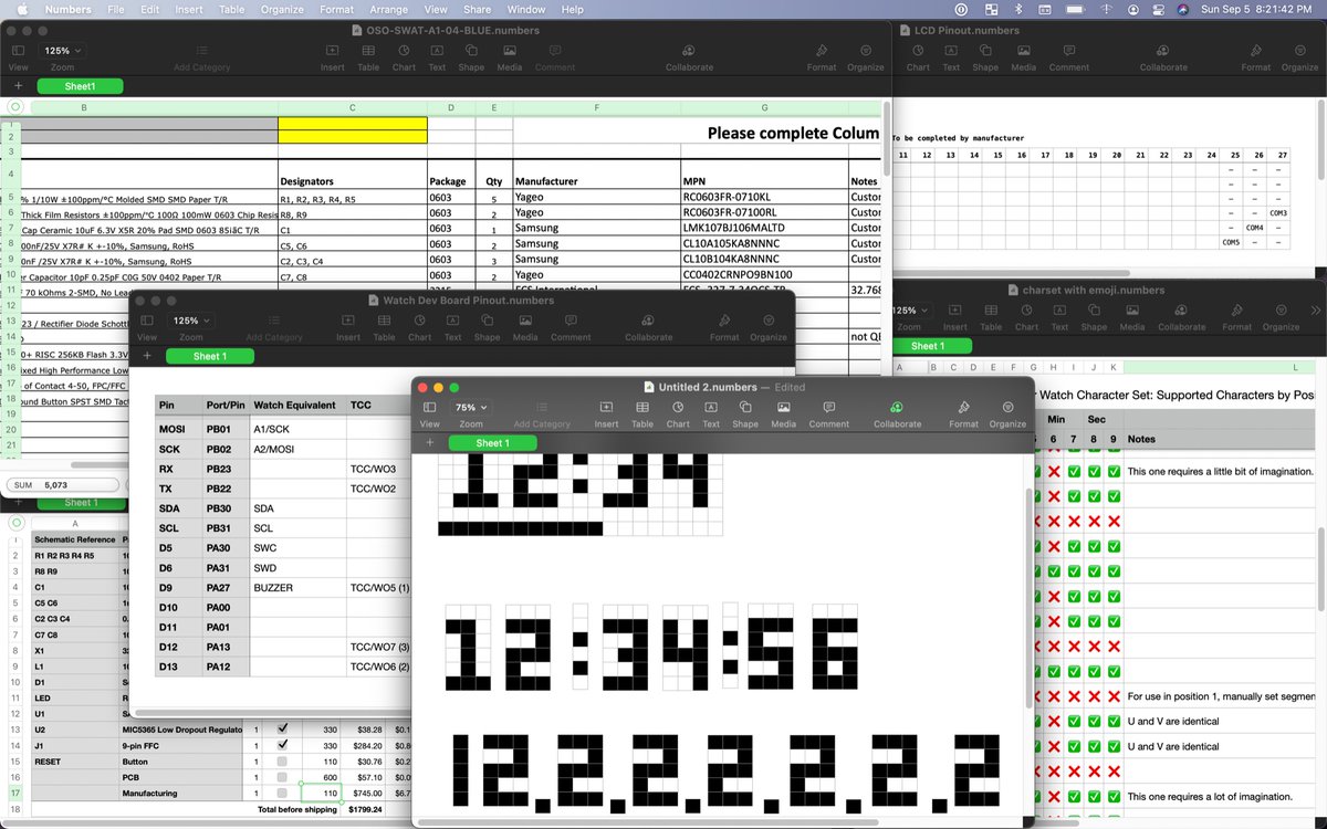
(original)
Replying to @josecastillo
if you think about it, a 3x5 pixel font is a lot like a 15-segment display: less efficient than a 14-segment design, more efficient than a 16-segment one. either way: not bad!
(original)
hmm:
(original)
Replying to @arturo182
the trick is to move faster so monday comes slower.
(original)
Replying to @tahnok
Not since very early revisions, but very fine enamel wire worked reasonably well through existing holes and gaps. Lately though I’m doing more development with debug printf’s over the USB serial console, and only sealing it up when I’m pretty sure my code is where I want it.
(original)
Replying to @josecastillo
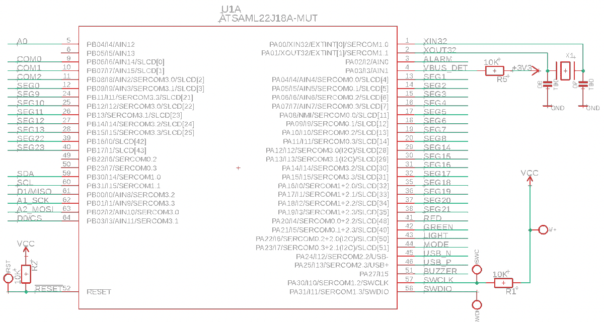
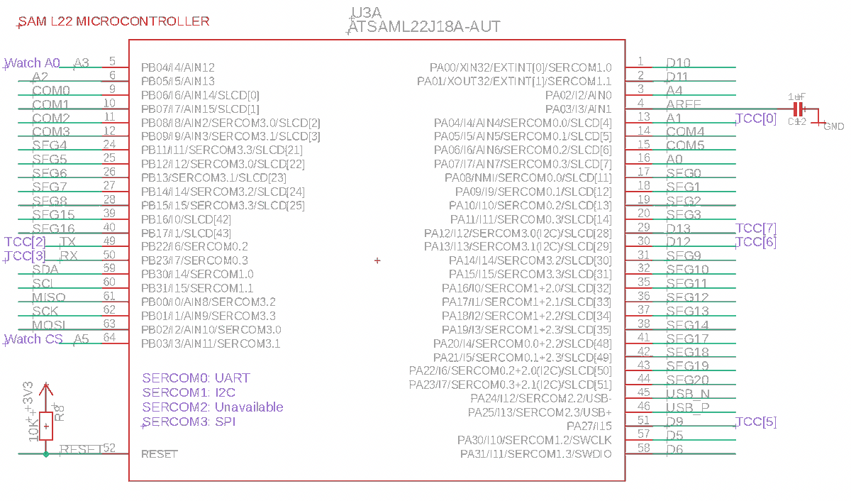
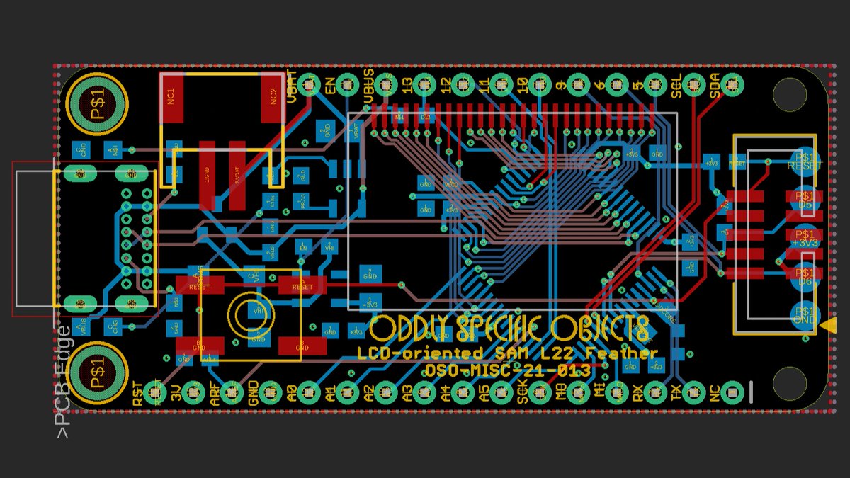
the pinout isn’t identical to the watch, but enough functionality is available to replicate all the features on different pins, and the LCD pins are all in the same order so the segment map should be the same. that’s the bit that required four layers… and some creative routing…
(original)
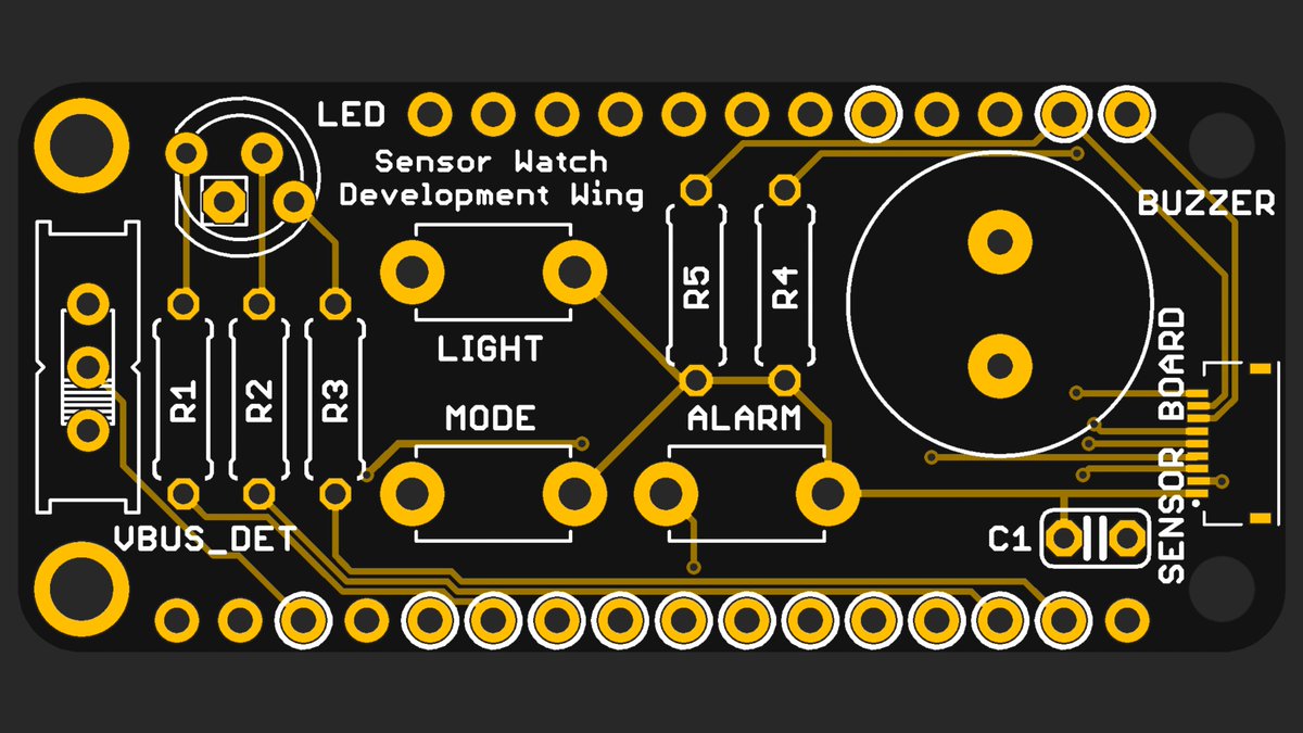
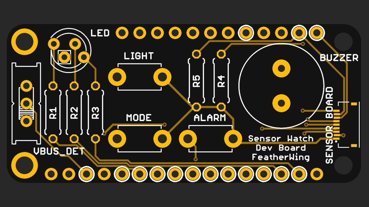
The other piece of the puzzle, currently slated for @oshpark’s Wednesday 4-layer panel. The idea is you can use this (plus yesterday’s wing) to prototype apps without having to disassemble the watch each time. Made it Feather compatible tho, so folks can do other stuff with it :)
(original)
Replying to @josecastillo
fixed it.
(original)
Replying to @josecastillo
come to think of it I probably need to add a spot for a 1µF capacitor, just in case
(original)
Replying to @gennyble
part one of two :)
(original)
this is going to look so pro in after dark.
(original)
today i ordered all of the parts required for the first run of 100 sensor watch boards. aka i’m the reason there’s only fifty of these 32 kHz crystals left in stock 😬 https://www.digikey.com/en/products/detail/ecs-inc/ECS-327-7-34QCS-TR/6050742
(original)
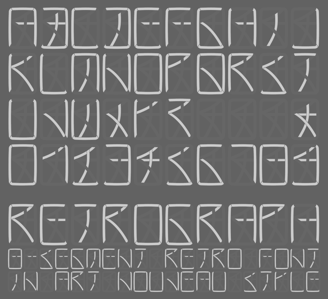
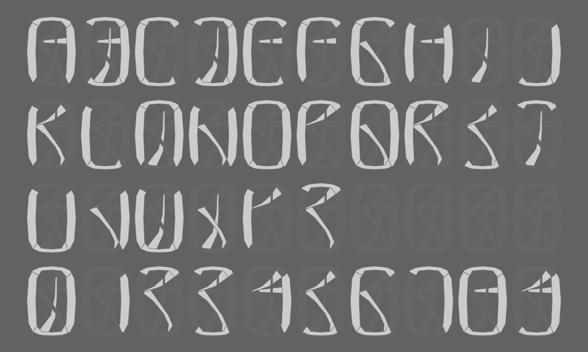
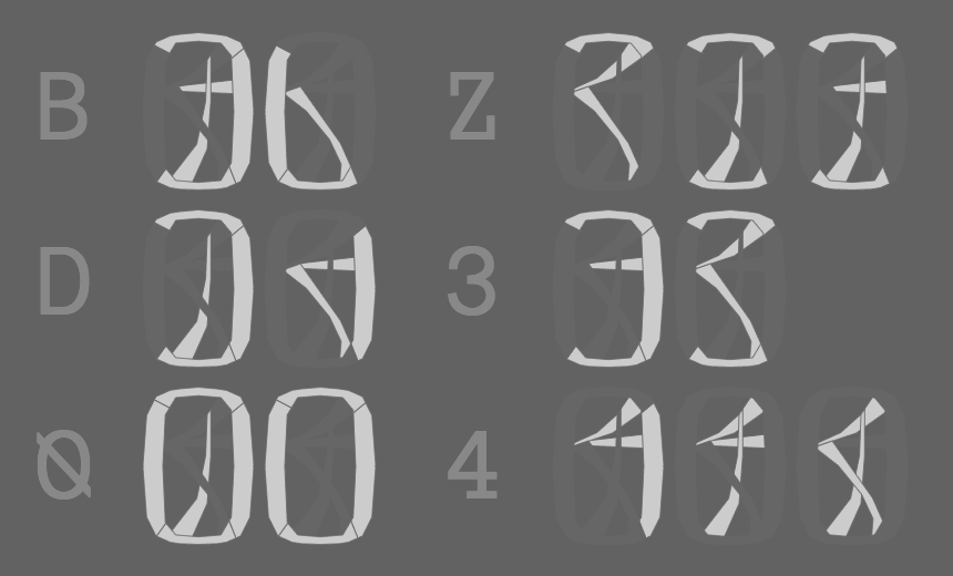
searching online for segment LCD inspiration; came across these 8-segment font studies by @adam_sporka. very cool! https://www.flickr.com/photos/adam_sporka/sets/72157603022145653/
(original)
Replying to @f4grx and @arturo182
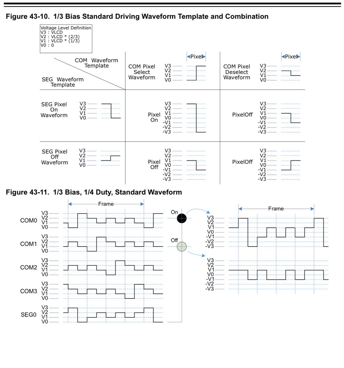
I think I get it. It’s applying an AC signal to all of the segments (because they hate being DC biased), but when COM and SEG combine to a small AC voltage, it’s not enough to energize the segment. It’s only when you zap a segment with ±3V that it actually turns on.
(original)
in hindsight, this isn’t cute or heartwarming. piezoelectric materials only do this when they are VERY DISTRESSED https://twitter.com/josecastillo/status/1432128281319464967
(original)
Replying to @babbageboole
I tried to lay it out myself a few times, but with 14-segment glyphs and 6 COM lines, every layout I came up with was as mayhem as the original F91-W — which is a lovable mess :)
My hope is just to put segments like colons and icons on the pins that my MCU can blink autonomously.(original)
I’m so stoked for the first handful of these to make it into beta testers’ hands! https://twitter.com/tahnok/status/1433525138755145728
(original)
Replying to @CyberQueenMara and @esden
I don’t actually know how to run a DRC on this kind of design! With a PCB fab house I at least know minimum trace width and spacing, but I’m less clear on how that works for an LCD fabricator. If you know of resources for this though I’d definitely appreciate any pointers!
(original)
Replying to @arturo182
But yea with the 27 pins on the display, the F91-W has 3 COM and 24 SEG, so it can operate 72 segments. I’m planning to use the same physical layout, but with 6 COM and 21 SEG, for 126 segments.
(original)
Replying to @arturo182
With 1/6 duty you can operate six times as many segments as you have SEG pins! They still just light up fully or not, though; contrast is controlled by the overall maximum voltage of the waveform (and, interestingly, the temperature).
(original)
Replying to @arturo182
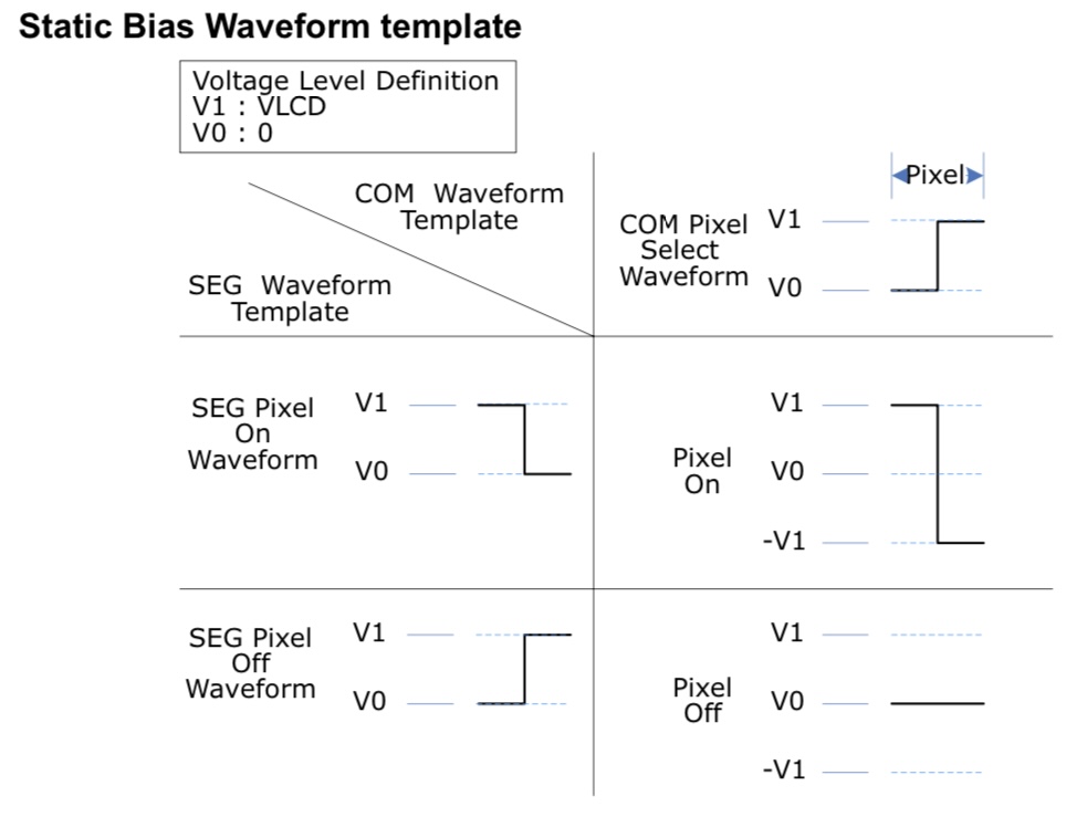
And then driver method has to do with the multiplexing: static LCDs have one COM pin and address each segment with one pin; 1/2 duty means 2 COM pins, etc. Bias is the number of driving voltages; static displays only need one, but with more levels, it can get more complicated…
(original)
Replying to @arturo182
Polarizer mode has to do with the display’s back layer: transparent means it’s see-through like a HUD, reflective means it’s opaque like a screen. Transreflective is kind of the best of both worlds: not as contrasty as a reflective screen, but I can add a backlight from behind.
(original)
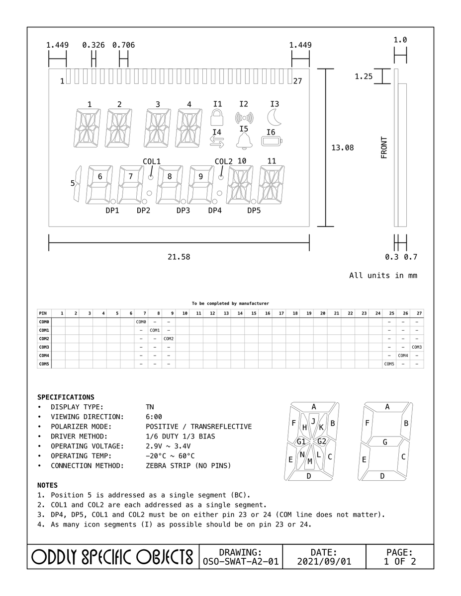
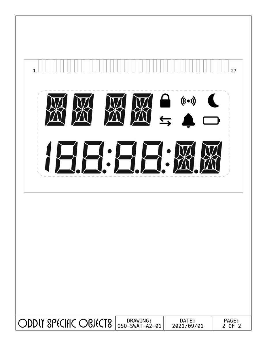
i have never done this before but i suppose you have to start somewhere. If anyone has experience getting custom LCD’s manufactured, I’m open to feedback on these drawings, and/or recommendations for folks I should be getting quotes from.
(original)
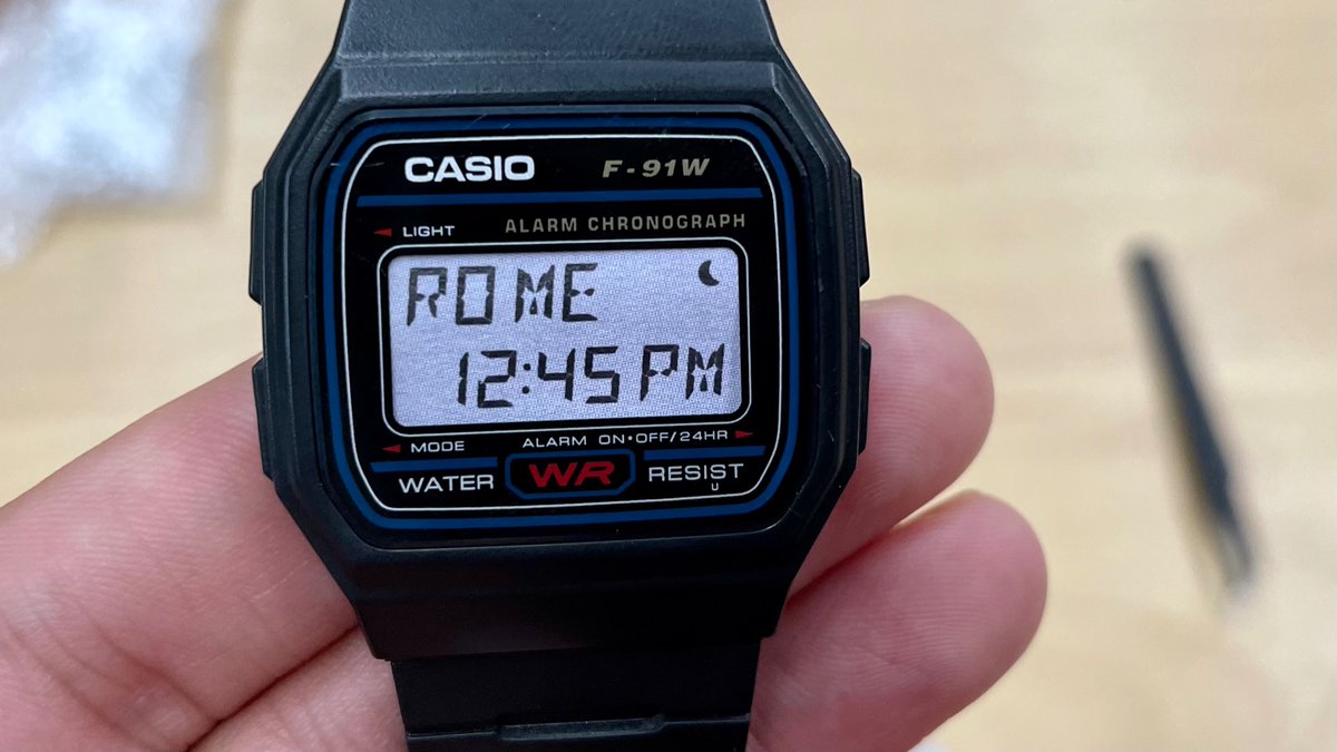
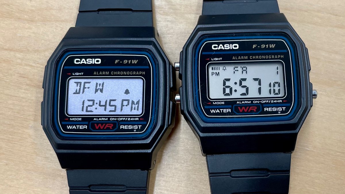
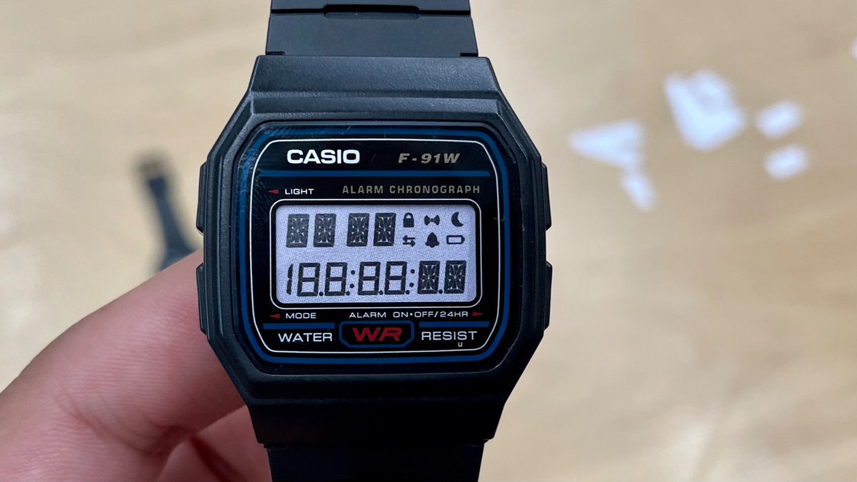
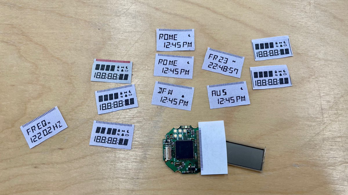
Paper craft screen tests. Findings: I had to shrink the font by a half point, and scoot the icons around. Also realized that putting a space between the 4 characters at the top left doesn’t affect readability much, and makes it possible to use it for two groups (i.e. day & date).
(original)
Replying to @NiVZ and @orviwan
Looks cool! Alas I don’t think it will work for this design; some of the segments take different and overlapping shapes for different characters (e.g. O and Q). The segments all have to be in consistent places to make them into a display.
(original)
Replying to @josecastillo
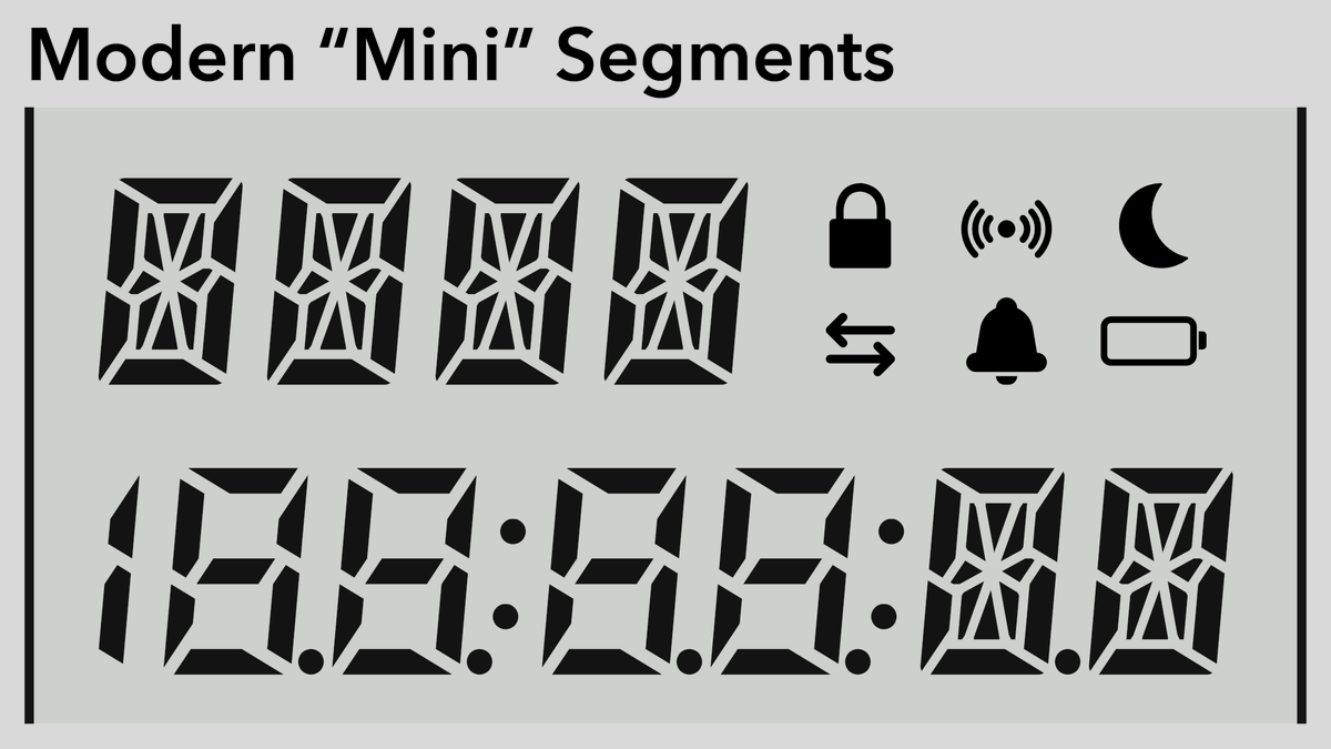
finally, all segments. The icons at the top right are, roughly:
• Padlock (locked, secure)
• Signal (sound, wifi, radio)
• Moon (sleep, silent, do not disturb)
• Arrows (data, exchange)
• Bell (alarm, notification)
• Battery (either on battery power, or low battery warning)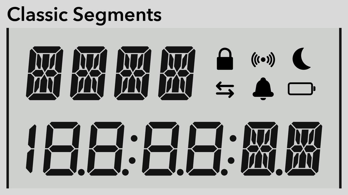
(original)
Replying to @josecastillo
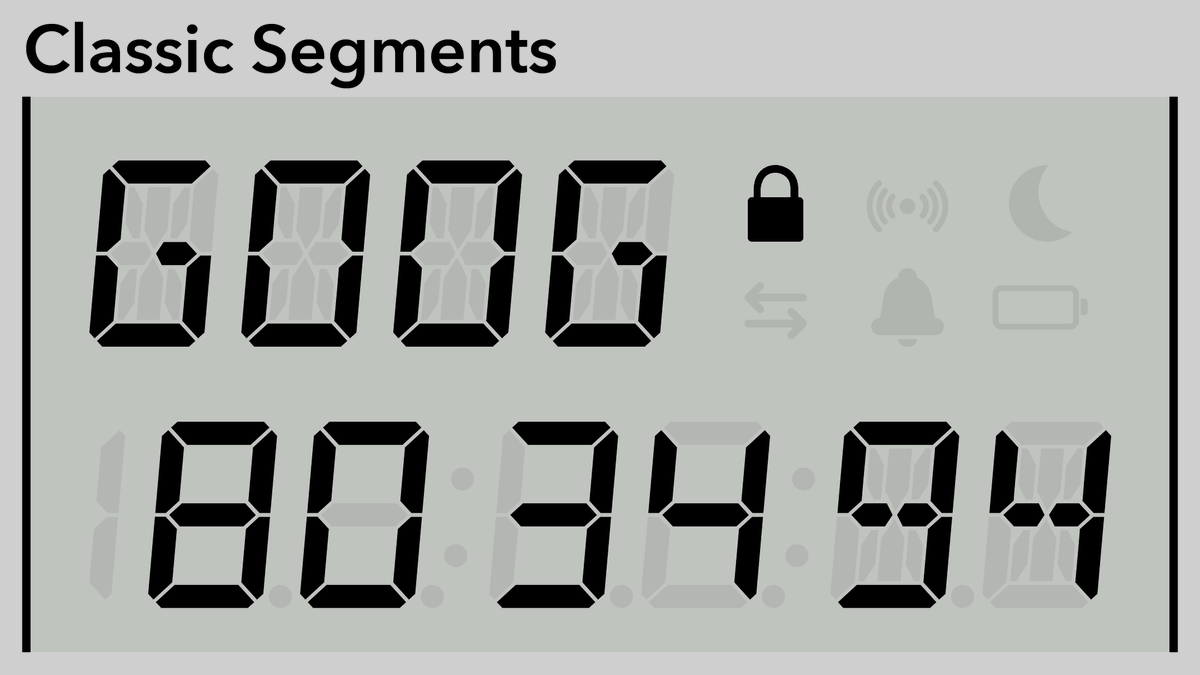
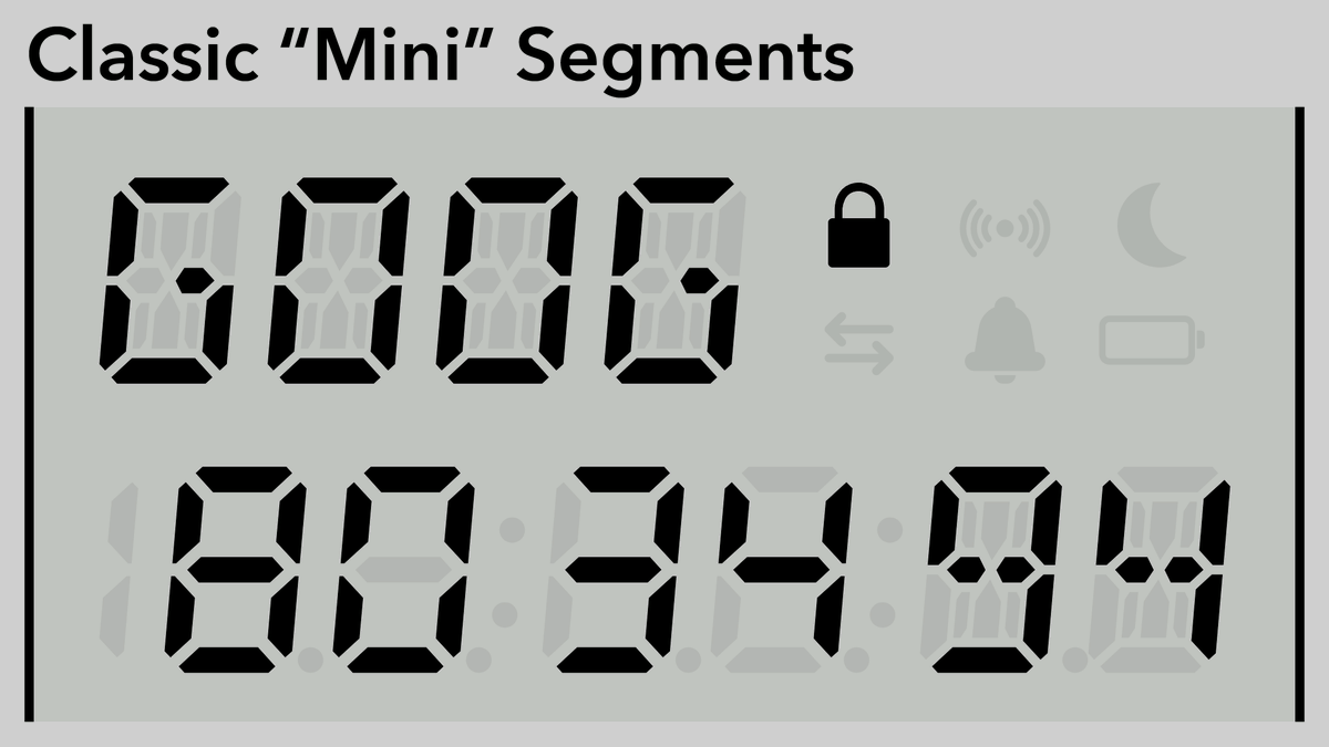
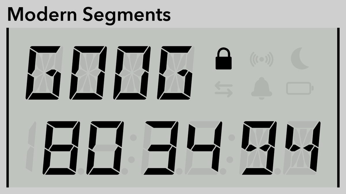
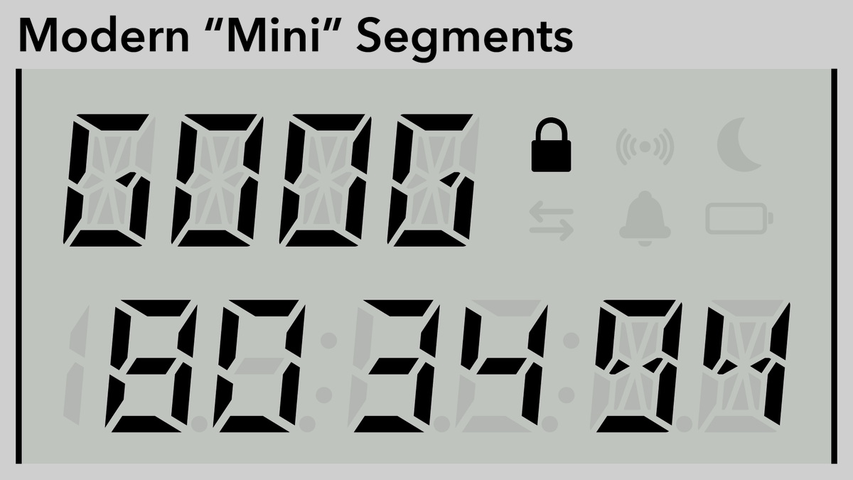
Once more with some more contrast. The colons in the bottom line do kind of shove the digits into groups of two, but I think it’s still pretty readable, and it makes the clock mode look much nicer.
(original)
Replying to @josecastillo
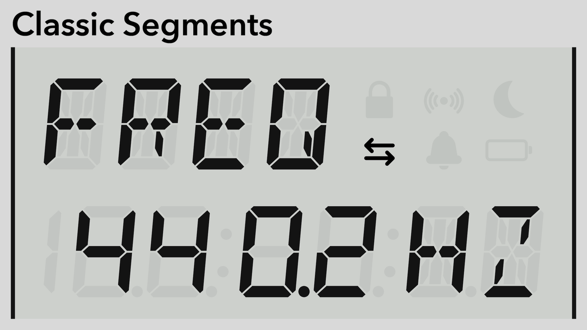
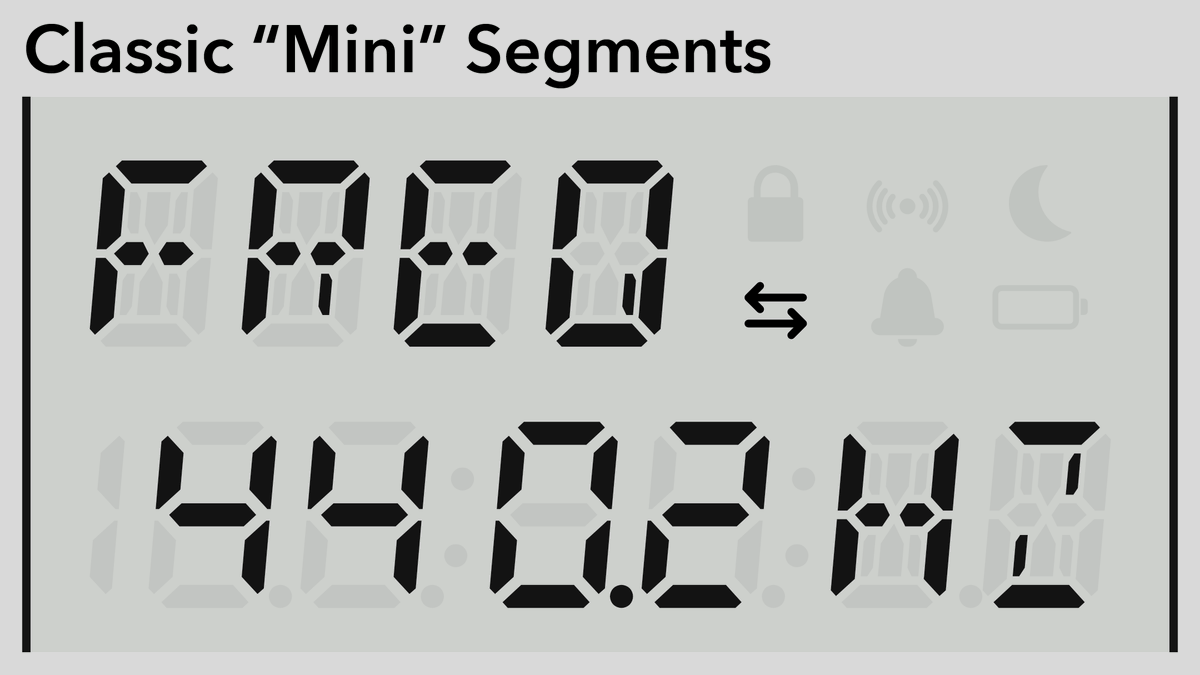
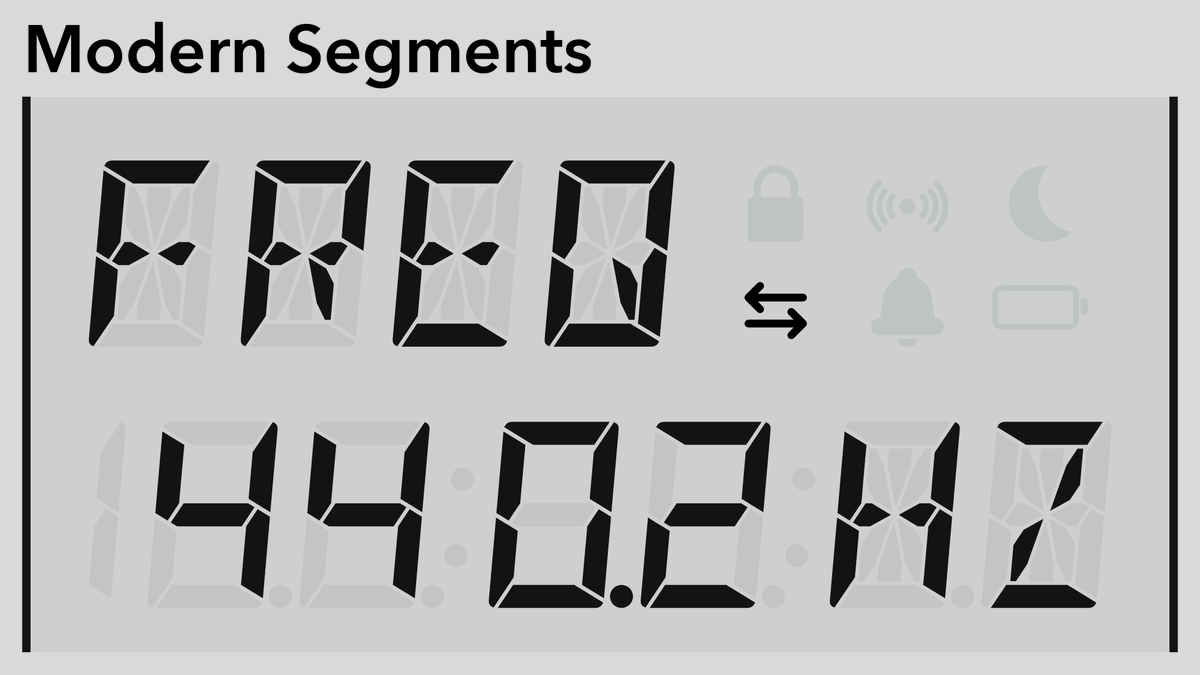
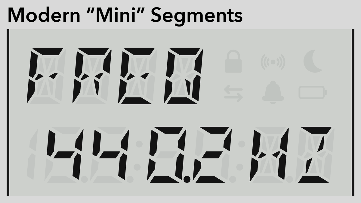
Another example, this time with all of the un-lit segments visible. Four positions are 7-segment digits that can only display numbers; the top line is alphanumeric for a mode or status, along with the last two to display units. Decimals between all digits except the leading ‘1’.
(original)
Replying to @josecastillo
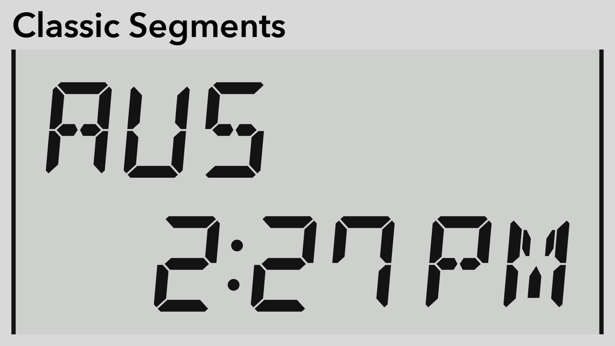
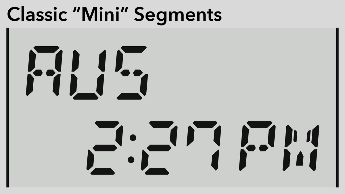
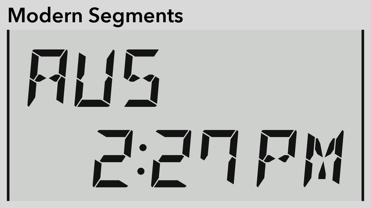
I’ll follow up with a couple more examples that show the full layout (with ‘off’ segments and all the indicators), but gut check: which of these segment LCD styles speak to you, which one would you choose if you were me?
(original)
Replying to @josecastillo
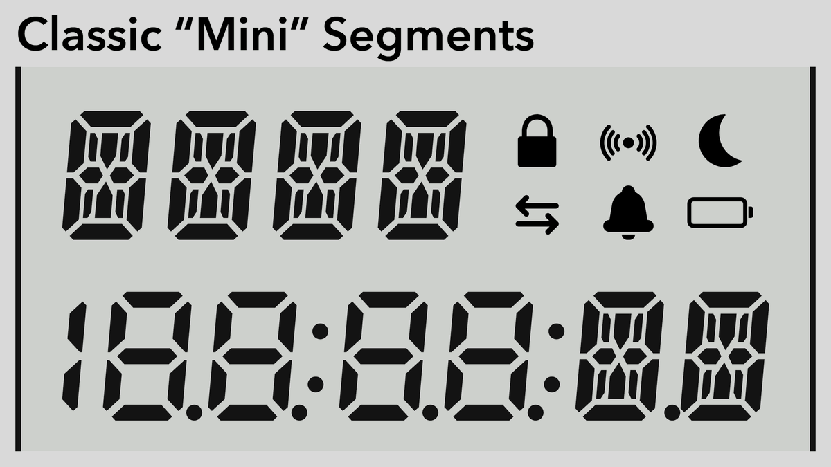
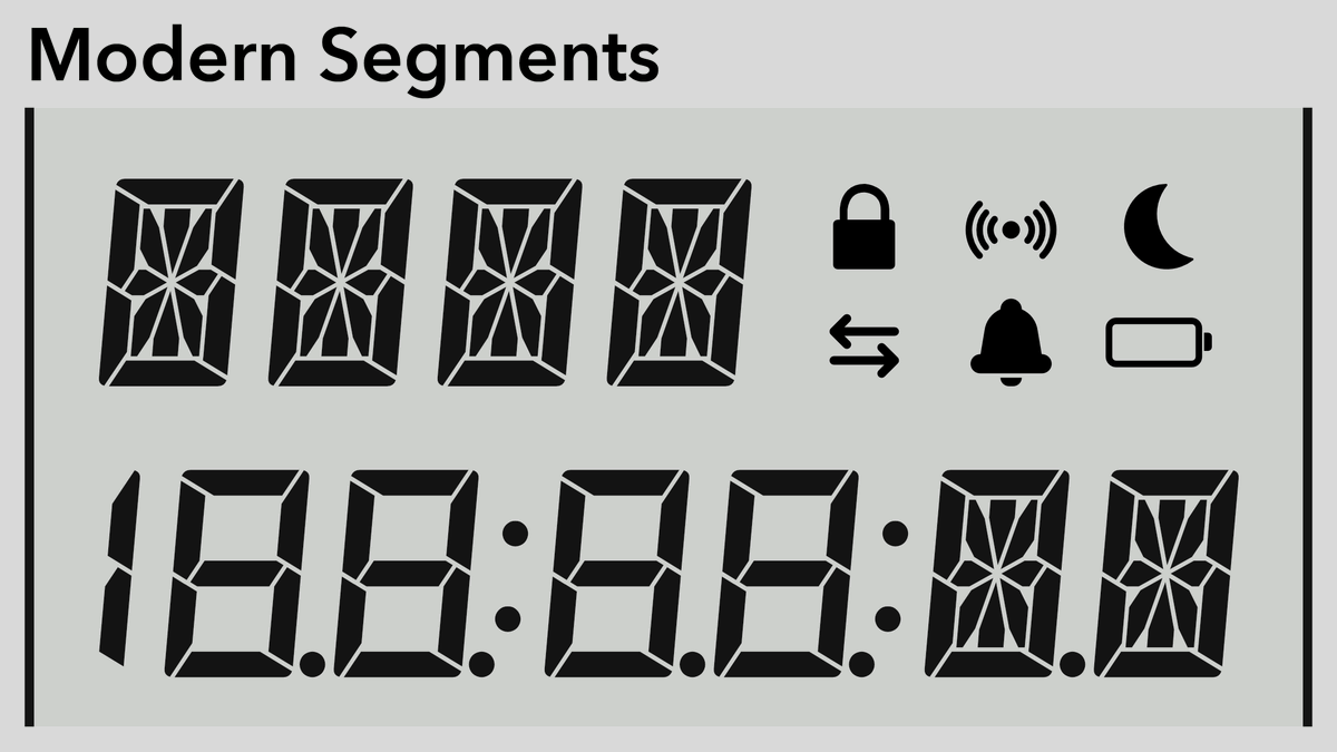
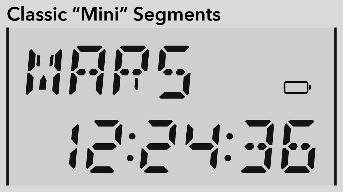
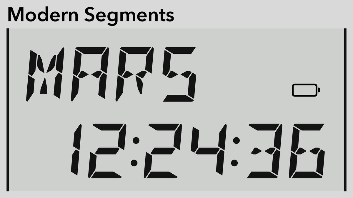
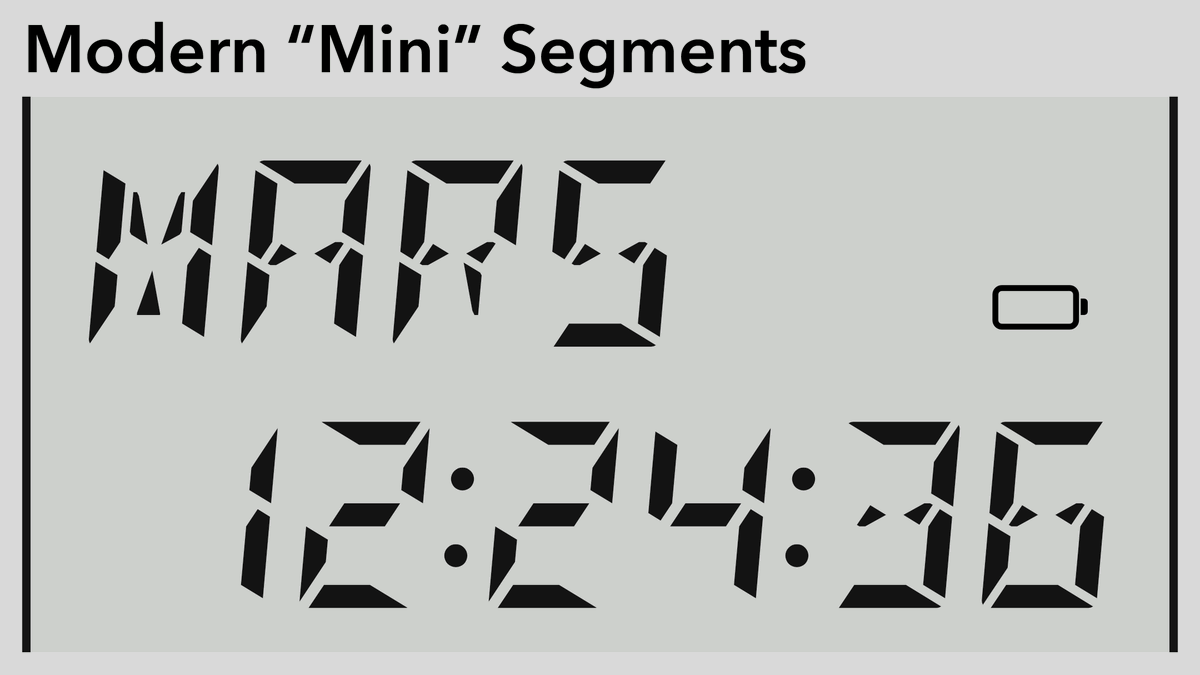
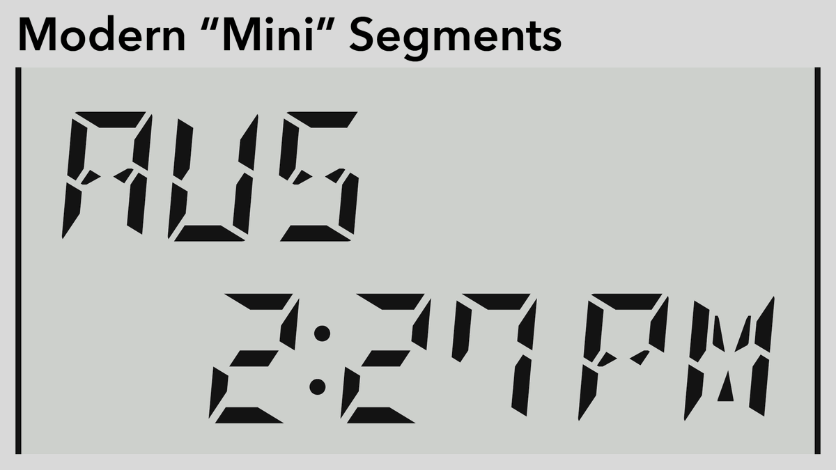
Credit where due: this is the DSEG font by @keshinomi_88pro: https://www.keshikan.net/fonts-e.html
“Classic” is your classic 7- and 14 segment glyph: bold & eminently readable.
“Modern” feels more angular and (dare I say) cyberpunk?
The “mini” versions shrink the segments and enlarge the gaps.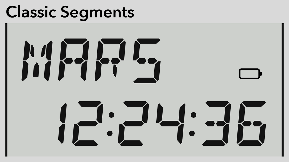
(original)
OK! It’s a bit belated, but now that the Sensor Watch board is real, I want to pursue the custom segment LCD display. I thought I had chosen the perfect font. But now I’m looking at some variants, and I don’t know what to think. Some examples in a thread, and a poll near the end:
(original)
I’m rather proud of this commit. I used to have two code paths for the LEDs: a digital output option that worked in standby mode, or a PWM option that didn’t. Then I realized: an LED stuck at 100% while the PWM driver is halted isn’t a bug. It’s a feature. https://github.com/joeycastillo/Sensor-Watch/commit/637964ae4bdbd5af4647e0e53789b77d66a23993
(original)
Replying to @Tropicexposure and @timonsku
If I ever do another watch mod, I want to do it for that one.
(original)
Replying to @stefandz
Atmel Power Debugger! Highly recommend. https://www.microchip.com/en-us/development-tool/ATPOWERDEBUGGER
(original)
The fact that digital watches from the 1980s lasted five to seven years on a single charge, and watches in the 2020s now last — at best — one to three days on a single charge, signals to me not a shift in technology, but a shift in values.
(original)
RT @kfury: Good points.

(original)
But it has what plants crave! https://twitter.com/US_FDA/status/1429050070243192839
(original)
Replying to @lukeweston
Contagion now reminds me of Idiocracy, in that they’re both fiction about a wildly more responsible world than the one we actually live in.
(original)
Replying to @josecastillo
Side note: the fact that the ALARM button can do this has everything to do with a re-spin of the board from a couple months ago. I talked about it with @glowascii on @Hacksterio Café. TL;DW: it had to be connected to one of just 3 low power interrupt pins. https://youtu.be/jUJJAMM30IY?t=27m31s
(original)
Replying to @gennyble
I think something was wacky with those tests; the processor was running at 4 MHz the whole time so that probably wasn’t it? But I did refactor a lot of stuff around the TCC that drives the light and buzzer; it’s possible something was running in standby that shouldn’t have been…
(original)
Replying to @josecastillo
Keeping the display on, but killing the one second updates (i.e. to show SLEEP and wake on button press) gets down to 13.5µA, or 10 months of standby. Turning off the display too? 7.2µA — over a year and a half with full RAM retention, ready to wake up and resume the running app.
(original)